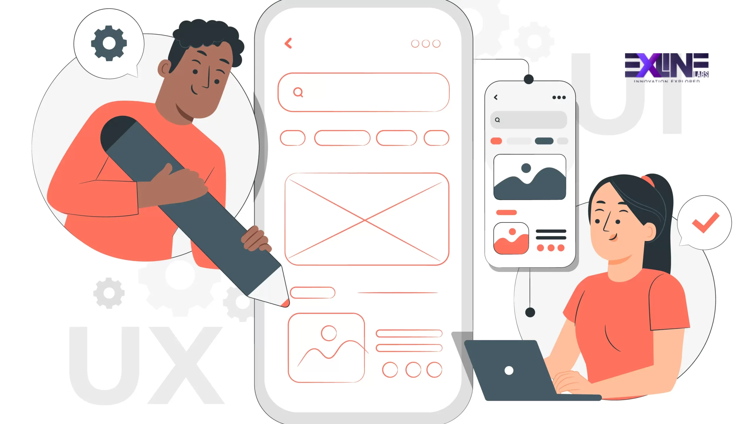
In today’s fast-paced digital landscape, where users are inundated with choices, creating a user interface (UI) and user experience (UX) that resonate with your audience is paramount. The age-old adage “the customer is always right” has never rung truer than in the realm of UI/UX design. To stand out in the crowded digital marketplace, businesses must prioritize customer-centric design. In this blog post, we’ll delve into the world of user-centric UI/UX design and share valuable tips backed by real-world examples to help you enhance user engagement.
Understanding User-Centric Design
Before we dive into the tips, let’s take a moment to understand what user-centric design really means. At its core, it’s about putting the user’s needs, preferences, and expectations at the forefront of your design process. It’s about creating digital experiences that are intuitive, efficient, and enjoyable, with the goal of keeping users engaged and satisfied.
Tips for Creating User-Centric Designs
Now, let’s explore some practical tips to infuse user-centricity into your UI/UX design process, illustrated with real-world examples:
1. User Research is Key
Real-world example: Airbnb
Airbnb’s success story is partly due to its dedication to user research. The company invested in understanding travelers’ and hosts’ needs, conducting extensive interviews and surveys. This led to features like user reviews and a host verification system, building trust among users and enhancing the overall experience.
2. Embrace Minimalism
Real-world example: Apple
Apple’s design philosophy has always revolved around simplicity. Their products, such as the iPhone and MacBook, feature clean, uncluttered interfaces with intuitive gestures. This minimalistic approach has made their devices accessible to users of all ages and tech-savviness.
3. Prioritize Mobile Responsiveness
Real-world example: Google
Google’s mobile search experience is a testament to responsive design. No matter the device, Google’s search page adapts seamlessly, ensuring a consistent and user-friendly experience for millions of users worldwide.
4. A/B Testing for Optimization
Real-world example: Facebook
Facebook regularly conducts A/B tests to optimize its UI. The platform experiments with button placements, notification styles, and content algorithms to improve user engagement. Continuous testing has helped them stay relevant and engaging.
5. Accessibility Matters
Real-world example: Microsoft
Microsoft’s commitment to accessibility is evident in products like Microsoft Teams. They offer features like real-time captioning and screen readers, making the platform inclusive for users with disabilities. This not only promotes inclusivity but also aligns with ethical design practices.
6. Content is King
Real-world example: Netflix
Netflix delivers content in an engaging format. Their user interface showcases visually appealing graphics, personalized recommendations, and a seamless streaming experience. This keeps users hooked and coming back for more.
7. Intuitive Navigation
Real-world example: Amazon
Amazon’s website boasts an intuitive navigation system with clear categories, easy-to-find search bars, and personalized recommendations. This ensures users can find what they’re looking for quickly, enhancing their shopping experience.
8. Feedback Loops
Real-world example: Spotify
Spotify encourages user feedback through features like playlists and personalized music recommendations. Users can easily share their preferences and receive tailored content, creating a sense of personalization and engagement.
9. Performance Optimization
Real-world example: Google Maps
Google Maps prioritizes performance. It loads quickly, provides real-time data, and offers offline functionality. This ensures users can rely on the app, even in areas with limited connectivity.
10. Stay Updated
Real-world example: Adobe Creative Cloud
Adobe Creative Cloud continually updates its design software to incorporate the latest design trends and technologies. This keeps designers engaged and excited about the tools they use, ultimately benefiting the end user.
By following these tips, you’ll be well on your way to creating UI/UX designs that put your customers first. Remember, a happy user is a loyal user.
Ready to Transform Your UI/UX?
If you’re ready to take your UI/UX design to the next level and provide your users with exceptional experiences, our UI/UX Design services can help. Click here to learn more.
Have questions or want to get started? Contact us today, and let’s make your digital dreams a reality.

