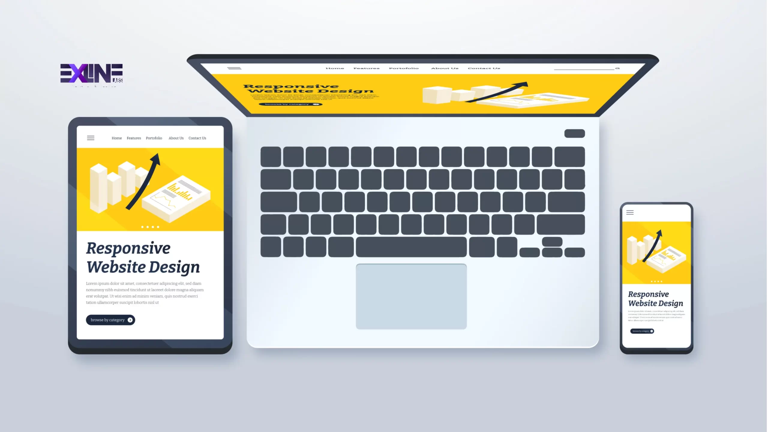
In the fast-evolving landscape of web development, creating a responsive website is paramount for providing an optimal user experience across diverse devices. This step-by-step guide will walk you through the process of building a responsive website from scratch, harnessing the power of HTML5 and CSS3. These latest web technologies not only enhance the aesthetics but also ensure seamless functionality on various screen sizes.
Step 1: Setting Up the Project
To embark on our journey, let’s start by setting up the project structure. Open your terminal and run the following commands:
|
1 2 3 4 |
mkdir responsive-website cd responsive-website mkdir css images touch index.html css/style.css |
These commands create the necessary folders and files for our project. The responsive-website folder is our project root, css will store our stylesheets, and images will hold any images used in the project.
Step 2: HTML5 Structure
Now, let’s structure our HTML file. Open index.html in your text editor and add the following code:
|
1 2 3 4 5 6 7 8 9 10 11 12 |
<!DOCTYPE html> <html lang="en"> <head> <meta charset="UTF-8"> <meta name="viewport" content="width=device-width, initial-scale=1.0"> <link rel="stylesheet" href="css/style.css"> <title>Your Responsive Website</title> </head> <body> <!-- Your content goes here --> </body> </html> |
This sets up the basic HTML5 document structure with a viewport meta tag for responsiveness and a link to our stylesheet.
Step 3: CSS3 Styling
Moving on to the styling, open css/style.css and add the initial styles:
|
1 2 3 4 5 6 7 |
body { font-family: 'Arial', sans-serif; margin: 0; padding: 0; } /* Add your styles for responsiveness here */ |
In this snippet, we set the font family, margin, and padding for the body. The real responsiveness magic will happen in the subsequent steps.
Step 4: Media Queries
Media queries are essential for adapting styles to different screen sizes. Let’s enhance our CSS with media queries:
|
1 2 3 4 5 6 7 8 9 10 11 |
@media only screen and (max-width: 600px) { /* Styles for small screens go here */ } @media only screen and (min-width: 601px) and (max-width: 1024px) { /* Styles for medium screens go here */ } @media only screen and (min-width: 1025px) { /* Styles for large screens go here */ } |
These media queries target small, medium, and large screens, allowing us to customize styles accordingly. Add your specific styles within each query to optimize the user experience.
Step 5: Testing
In the testing phase, meticulous attention is crucial to guarantee the seamless performance of your website across diverse devices and browsers. Leveraging powerful tools is key to this endeavor. Chrome DevTools offers an insightful environment for debugging and optimizing, allowing you to simulate various device conditions. Firefox Responsive Design Mode is another valuable tool, enabling real-time visualization of how your site appears on different screen sizes.
For a more exhaustive examination, consider utilizing platforms like BrowserStack. This online tool provides a comprehensive testing environment, allowing you to assess your website’s functionality on a myriad of browsers and devices. With BrowserStack, you can emulate real user experiences, ensuring that your responsive design holds up under various scenarios.
Testing isn’t just about functionality – it’s about delivering a consistent and enjoyable experience to users, regardless of the technology they choose. By investing time and effort into testing, you solidify your website’s reliability and responsiveness, ultimately enhancing user satisfaction and engagement.
Step 6: Deployment
When content with the responsiveness and functionality of your website, the next crucial step is deployment. A plethora of hosting platforms is available, each with its unique features. Opting for platforms like Netlify, GitHub Pages, or Vercel simplifies the deployment process and enhances scalability.
Netlify, known for its simplicity, offers continuous deployment directly from your Git repository. GitHub Pages seamlessly integrates with your GitHub repository, providing a straightforward hosting solution. Vercel, with its focus on performance, not only hosts your website but also optimizes it for speed.
Follow the specific deployment instructions of your chosen platform. Typically, you’ll connect your repository, configure settings, and trigger the deployment process. These platforms often provide custom domains and SSL certificates, ensuring a secure and professional online presence.
Congratulations! With the deployment completed, you’ve not only brought your responsive website to life but also ensured it delivers an excellent user experience across a spectrum of devices. Your dedication to responsiveness is a testament to your commitment to providing a seamless and accessible digital experience for all users.
Explore our services here and get in touch with us here. Let’s elevate your online presence together!