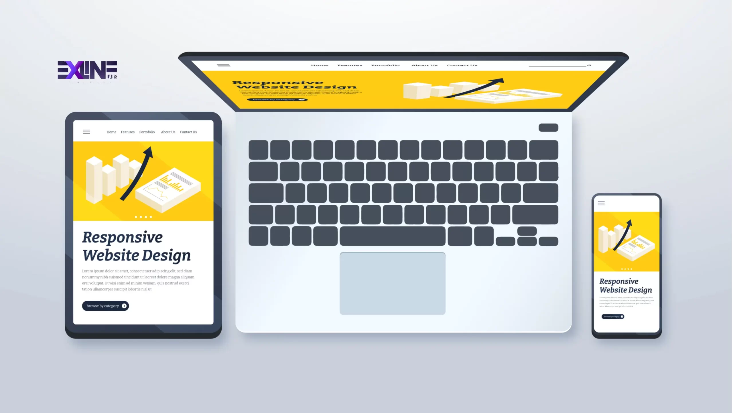
In today’s fast-changing world of web development, a responsive web design is essential for delivering an excellent user experience on any device. Whether a user visits from a desktop, tablet, or smartphone, a responsive design ensures that your website adjusts beautifully to any screen size.
This step-by-step guide walks you through how to create a responsive website from scratch using HTML5 and CSS3. These two technologies form the foundation of modern web design, ensuring your website looks clean, professional, and functions smoothly across all devices.
Step 1: Setting Up the Project
Start by setting up your project folder and structure. Open your terminal and run the following commands:
These commands create a clean project setup. The responsive-website folder acts as the root directory, css will store your stylesheets, and images will hold visuals used in your project.
Step 2: Structuring Your HTML5 File
Next, build the foundation of your website with HTML5. Open index.html and add the following code:
This creates a valid HTML5 structure and includes the viewport meta tag, which ensures your responsive website development adapts correctly to mobile devices.
Step 3: Adding CSS3 Styling
Now it’s time to style your website. Open css/style.css and add the initial styles:
This establishes your base styling. You can now define layouts, colors, and typography. Later, you’ll use media queries to make the layout fully responsive.
Step 4: Applying Media Queries for Responsiveness
Media queries are the key to achieving a mobile-friendly website design. They allow your styles to adapt to different screen sizes.
Each query helps you tailor your layout for specific devices, ensuring a consistent and user-friendly experience. For example, you might adjust font sizes or switch from a two-column layout to a single-column layout on smaller devices.
Step 5: Testing Across Devices
Testing ensures your responsive web design works perfectly everywhere.
Use tools like Chrome DevTools or Firefox Responsive Design Mode to preview how your site looks on various screen sizes. For more comprehensive testing, platforms like BrowserStack or LambdaTest let you check performance on different browsers and devices.
Testing confirms that your website delivers a smooth and consistent experience for every visitor, no matter what device they use.
Step 6: Deployment
Once your site is fully responsive, it’s time to deploy it. Platforms like Netlify, GitHub Pages, or Vercel make this process simple and fast.
-
Netlify: Offers easy Git integration and automatic deployments.
-
GitHub Pages: Great for small projects and portfolios.
-
Vercel: Ideal for high-performance, scalable websites.
Follow your chosen platform’s setup instructions to connect your Git repository and push your files live. Most hosting tools also offer free SSL certificates and domain integration, ensuring your responsive website appears secure and professional.
Conclusion
Congratulations! You’ve successfully created a fully responsive website using HTML5 and CSS3. You now have a solid understanding of layout setup, CSS3 styling, and media queries for device responsiveness.
Building a responsive web design is not just about making a site look good. It’s about enhancing accessibility, user engagement, and SEO performance — all of which are essential to digital success.
At Exline Labs, our team specializes in responsive website development and mobile-friendly website design built on UX-first principles. Explore our responsive web design services or get in touch with our team to discuss how we can help you create stunning, user-focused websites that perform beautifully across every device.