Why most UX audit reports are useless
Many founders receive UX audit reports that look polished but fail to drive change. They are filled with screenshots, vague comments, and generic advice. The problem is not the audit itself but the quality of the deliverable. A good UX engineering services report should be actionable, not just a critique but a roadmap. It should tell you exactly what is wrong, why it matters, and how to fix it. Anything less is decoration.
The difference between a superficial report and a useful one is detail. A useful report is structured, prioritized, and designed to be executed. It is not just a critique. It is a roadmap for reducing churn and improving retention.
Heuristic evaluation findings with severity ratings
The backbone of a strong UX audit report is a heuristic evaluation. This is a structured review of the product against usability principles. Each issue should be documented with a severity rating.
For example, a confusing button label might be marked as “medium severity” because it slows users down but does not block them. A broken navigation link would be “high severity” because it prevents progress. A missing confirmation message might be “low severity” because it causes mild uncertainty but not abandonment.
Severity ratings matter because they help founders and teams' priorities. Without them, everything looks equally urgent, and resources are wasted. A good report will show not just what is wrong but how serious each issue is.
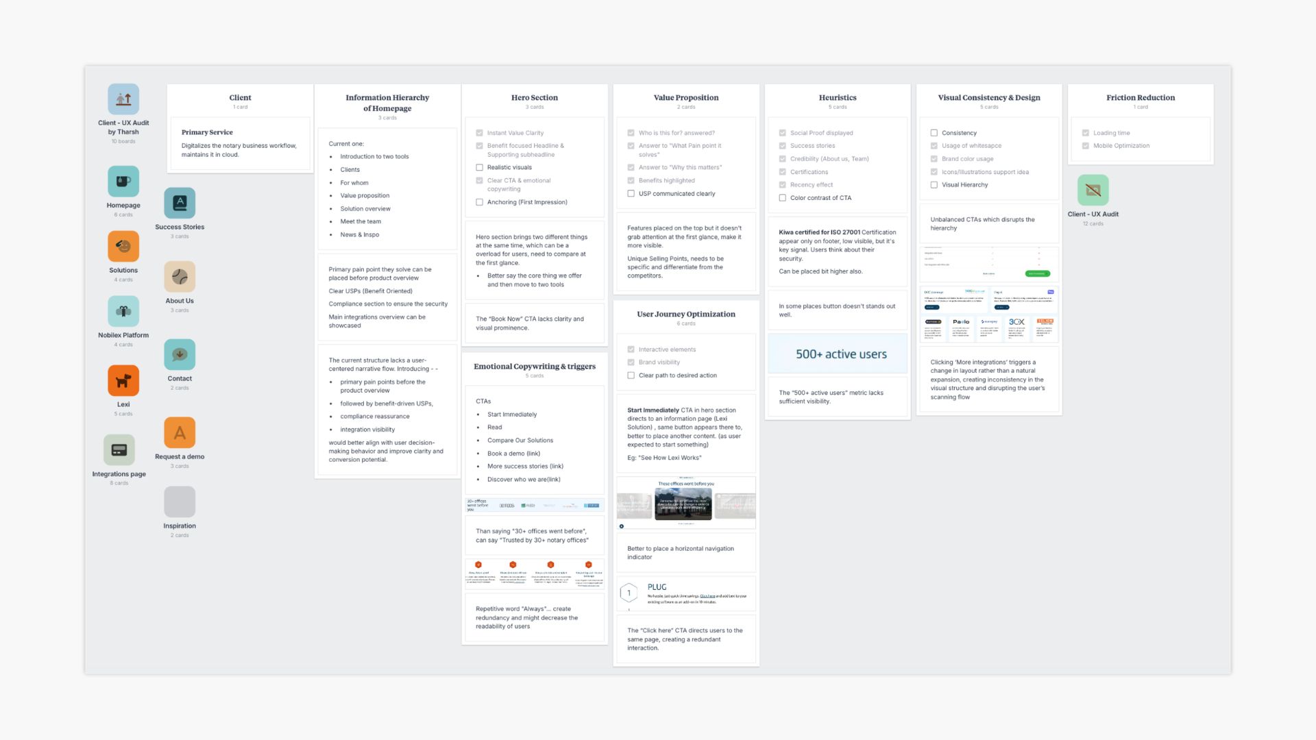
The user journey map with annotated friction points
A UX audit report should include a user journey map. This visual shows how a typical user moves through the product. The map should be annotated with friction points.
For example, onboarding may show a drop at step three where users abandon a form. The annotation explains why: the form asks for information the user does not have. Another annotation may highlight that users hesitate on the dashboard because too many metrics are displayed at once.
This section is critical because it connects issues to the real journey. Founders can see where users are struggling and understanding the context. It is not enough to list problems. The report must show how those problems affect the flow.
Analytics findings
Data is the proof point. A good UX audit report includes analytics findings that show where users are dropping off. Funnel analysis, heatmaps, and session recordings provide evidence.
For example, analytics may reveal that 40 percent of users abandon onboarding at step three. To understand how analytics combine with a SaaS UX audit to diagnose churn, read our dedicated guide.
The report should explain what the data suggests and connect it to observed friction. Heatmaps may show that users ignore a key button because its label is unclear. Session recordings may reveal repeated attempts to complete a form that is too complex.
This section ensures that recommendations are not based on opinion. They are backed by numbers. Founders can trust the report because it shows both qualitative and quantitative evidence.
Prioritized recommendations with effort vs impact matrix
A UX audit report should not stop problems. It must provide solutions. The best reports include prioritized recommendations presented in an effort vs impact matrix. This matrix shows which changes deliver the biggest results for the least effort.
For example, moving a VAT field from step three to step six may be low effort but high impact. Redesigning the entire dashboard may be a high effort and a medium impact. The matrix helps founders decide what to tackle first.
This section is where the report becomes actionable. It is not enough to say, “fix onboarding.” The report should say “remove unnecessary fields from onboarding, move VAT to step six, and simplify the welcome screen.” Each recommendation should be specific, measurable, and tied to impact.
Technical handoff notes for the development team
A UX audit report is not just for founders. It must also serve the development team. That means including technical handoff notes. These notes explain what needs to be changed, how it should be implemented, and any dependencies.
For example, if a button label needs to be updated, the note should specify the exact component and file. If a workflow needs to be simplified, the note should outline the steps to remove. If accessibility issues are found, the notes should reference the relevant WCAG guidelines.
This detail prevents confusion and ensures that recommendations can be executed quickly. Without technical notes, developers are left to guess. That slows progress and increases the risk of mistakes.
What to do with a UX audit report once you have it
Receiving a good UX audit report is only the start. Founders should use it as a roadmap. Begin with the high-impact, low-effort changes. Track churn and retention metrics over 90 days. Share the report with the development team and make sure technical notes are acted on.
A report is valuable only if it leads to change. Too many founders file it away after reading the summary. The real benefit comes from execution.
Founders should also communicate the findings to the wider team. Designers, marketers, and support staff all benefit from understanding where users struggle. A UX audit report is not just a technical document. It is a tool for alignment.
Red flags in a superficial audit report
- Not all reports are equal. There are red flags that signal a superficial audit.
- No severity ratings. If every issue looks the same, prioritization is impossible.
- No user journey map. Without context, problems are just a list.
- No analytics findings. Opinions without data are unreliable.
- No prioritized recommendations. A report that only points out problems is incomplete.
- No technical handoff notes. If developers cannot act on the report, it is useless.
Founders should be wary of reports that look polished but lack these essentials. A superficial report wastes time and money.
Closing thoughts
A UX audit report should be more than a PDF with screenshots. It should be a practical document that guides action. The best reports include heuristic findings with severity ratings, a user journey map, analytics evidence, prioritized recommendations, and technical handoff notes.
When these elements are present, the report becomes a tool for reducing churn and improving retention. Learn more about our UX engineering services and how we deliver audit reports that drive real change.
If you want to see what an Exline Labs UX audit report looks like, book a free 30-minute review with Tharsh: https://cal.com/exlinelabs/30min