project-descriptive-image

How we conducted UX redesign that transformed Thymometrics into a clearer, friendlier platform

Thymometrics Limited is a UK-based company that offers the Thymo™ employee feedback and engagement platform. This platform has been specifically built as a hub for tracking employee insights real-time. Currently, Thymo™ is an established platform which is pretty much active and well-reputed in the HR tech space.

When considering the specialty of Thymometrics (Thymo™), it addresses a core challenge that organizations struggle with. Thymo™ has replaced the traditional employee engagement surveys that are conducted only a few times per year with continuous real-time insights into areas like employee mood, engagement and well-being as it is a SaaS-based platform. Furthermore, Thymometrics has the potential of conducting interactive surveys and analytics. 

As a UK-based MVP agency possessing a deep expertise, we at Exline Labs, we offer UX design for startups. There we partnered with Thymometrics to level-up their platform. Our mission: streamline user journeys, implement latest web design trends, and deliver a custom UI design that makes feedback easy, actionable, and visually appealing.

Project image

Understanding User Pain Points Before Redesigning Solutions

As the first step, we conducted a complete analysis of the existing platform of Thymometrics. There we obtained a clear figure about the engaging stakeholders. 

Moreover, we gathered the core objectives of the platform as follows:

  • Simplifying complex dashboards and analytics panels
  • Modernizing the overall interface
  • Improving navigation and usability
  • Ensuring accessibility and consistent branding

Next we conducted an in-depth competitor analysis of direct and indirect competitors. There we were able to identify the key trends, strengths, weaknesses, and trends to decide the design direction.

What We Found Beneath the Surface | UX Weaknesses

Via conducting the complete analysis, our team was able to spot the key issues of the former UX.

  • Cluttered layouts: When the layouts are filled with too much information, that overwhelms users making it harder to focus on insights that drive decisions.

  • Lack of design consistency: Mixed visual styles like different button styles negatively affect familiarity. Consequently, users lose trust and struggle to interact confidently.

  • Confusing navigation flows: Unclear paths force users to guess where to go. This increases frustration and slows down task completion.

  • Accessibility gaps: Because of the accessibility gaps, all users could not engage with the platform equally, leading to exclusion and missed opportunities for adoption.

  • Lack of clear visual hierarchy: Important data got listed under less relevant details. As a result, decision-makers could not quickly spot what matters most.

Wireframing | Mapping Out the User Journey

Throughout this phase, we built low-fidelity wireframes in Figma. There we mainly focused on the following factors.

  • Clear content placement and hierarchy

  • Prioritizing key metrics and actions

  • Smooth user flows for employees and managers

Style Guide | Design That Works Everywhere

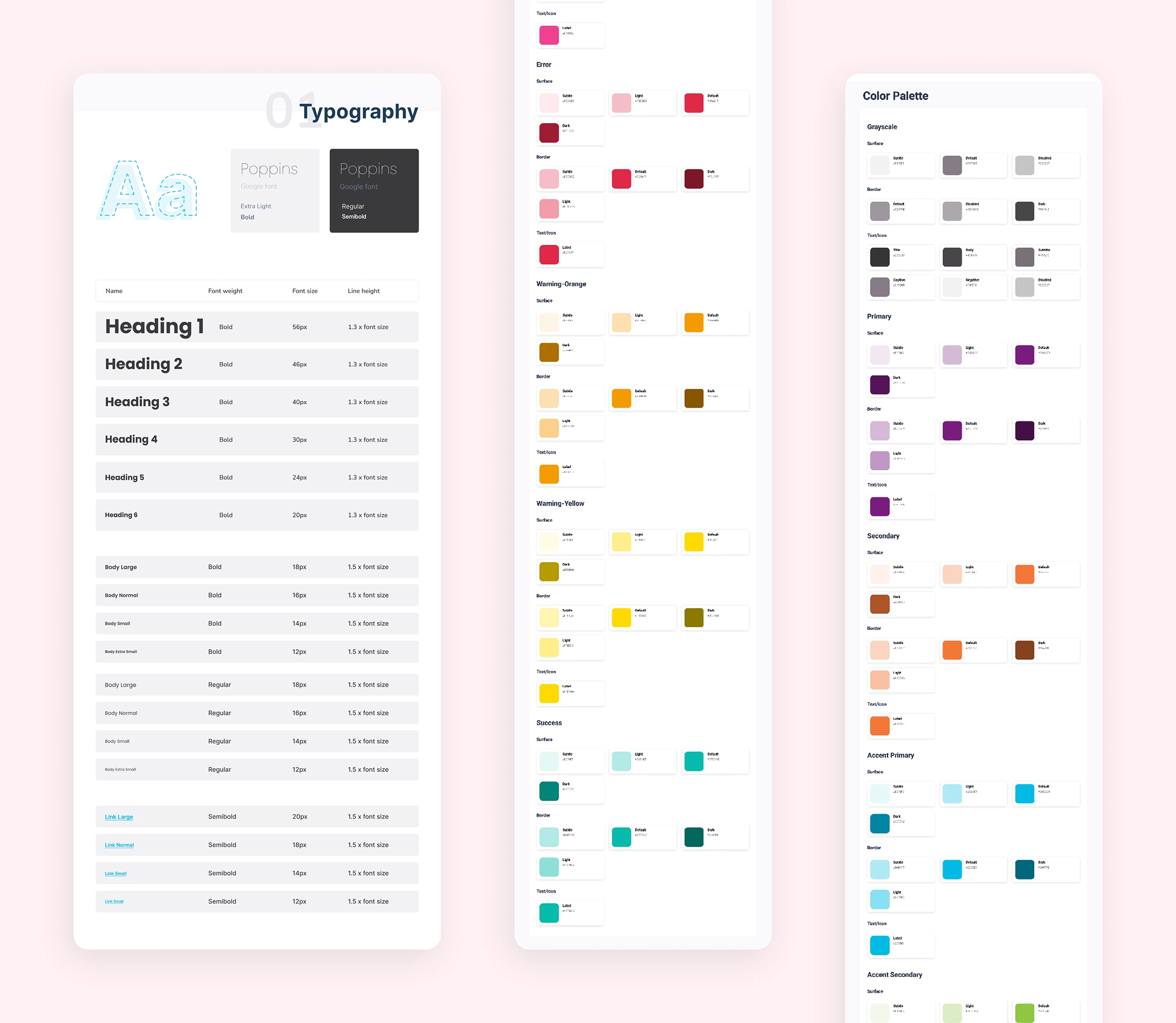
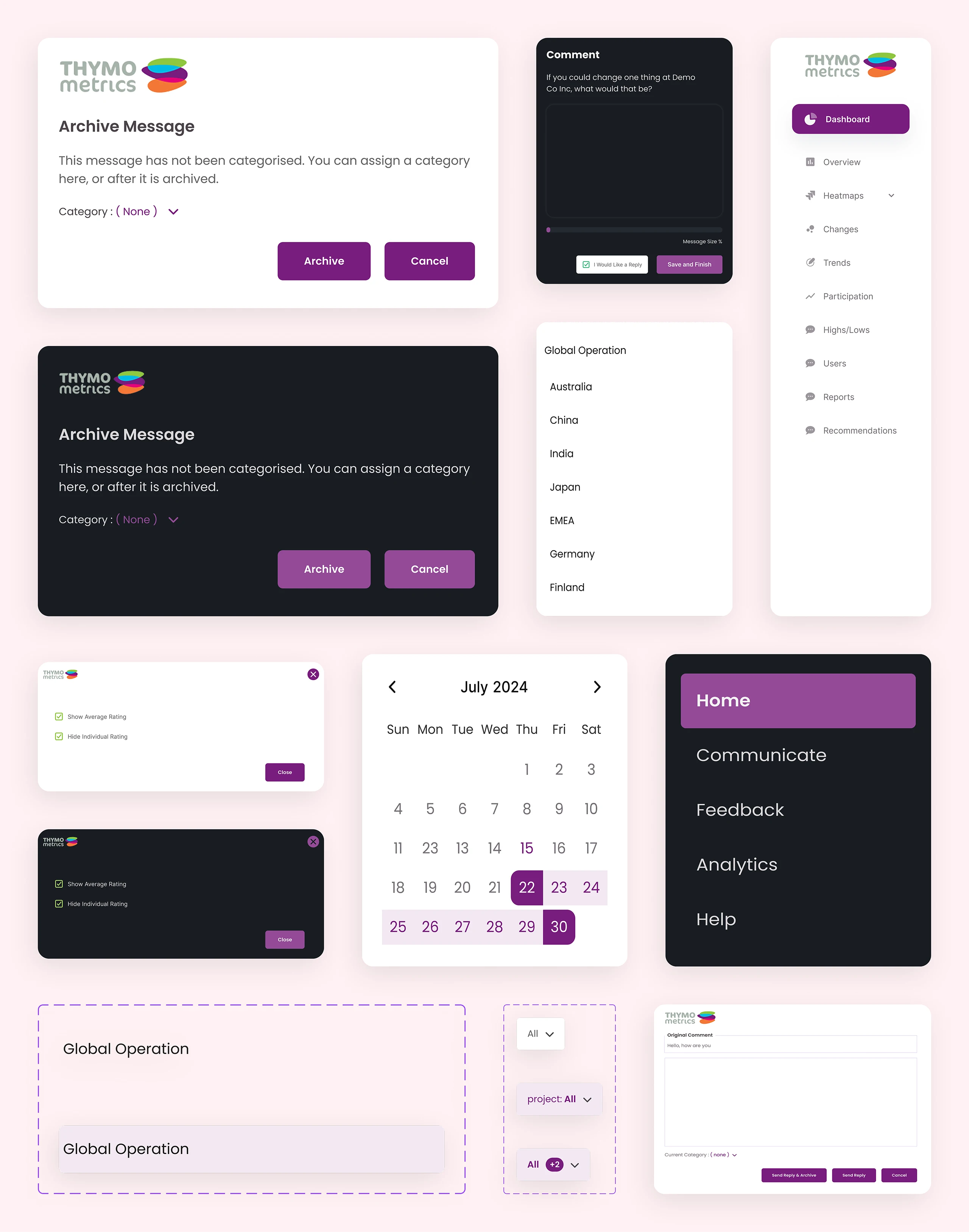
As mentioned in the above, there was a remarkable inconsistency in the design elements. Therefore, we developed a cohesive visual identity as follows:

  • We developed color palettes for both light and dark modes

  • We paid attention to the fullest on readability and hierarchy when planning the typography.

  • Icons and UI components were planned for consistency.

  • Unified styling was followed on buttons, cards, and tables.

Consequently, a polished, professional look across the platform was acquired. Most importantly, the above elements decreased friction for future updates of the Thymometrics platform. 

From Wireframes to a Working Dashboard

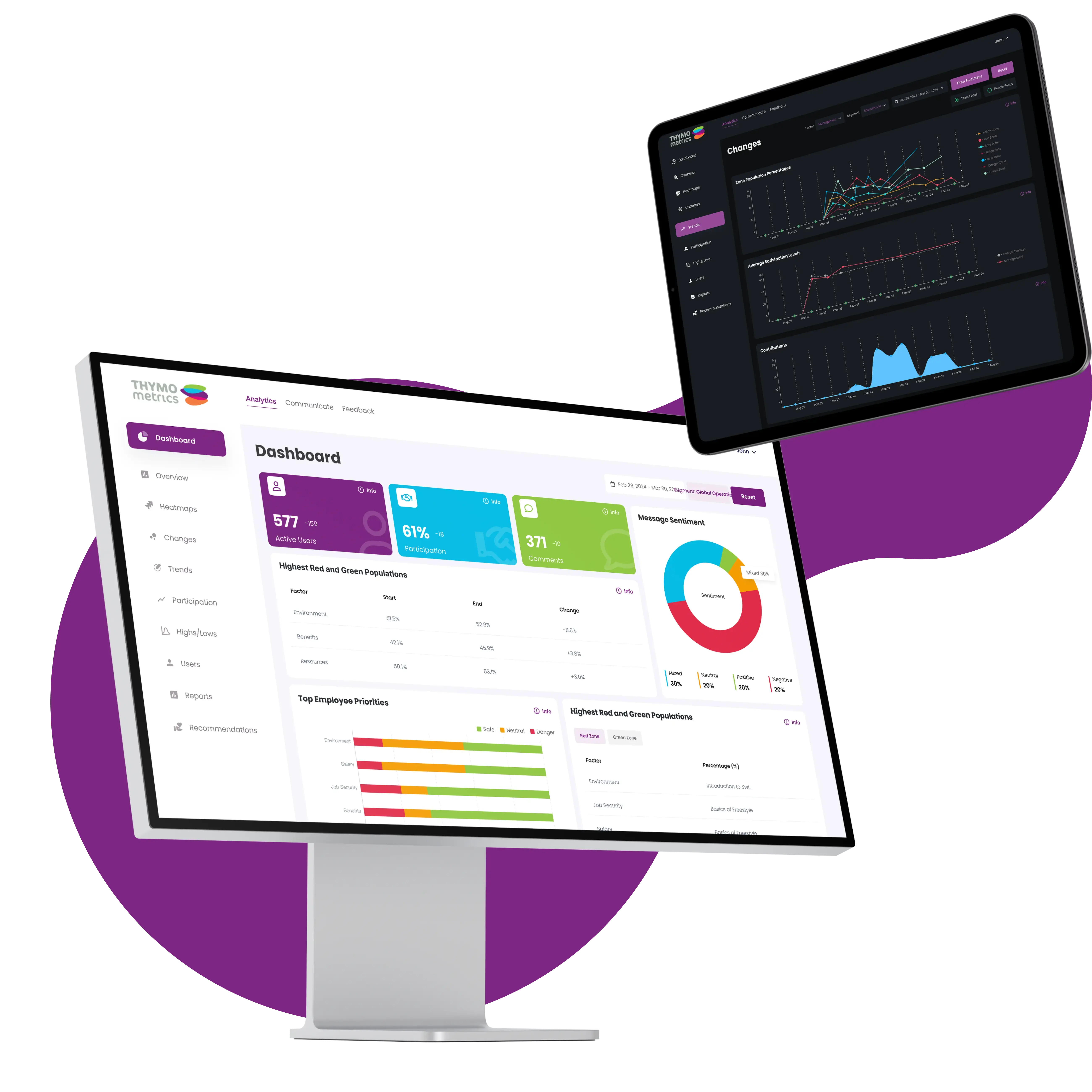
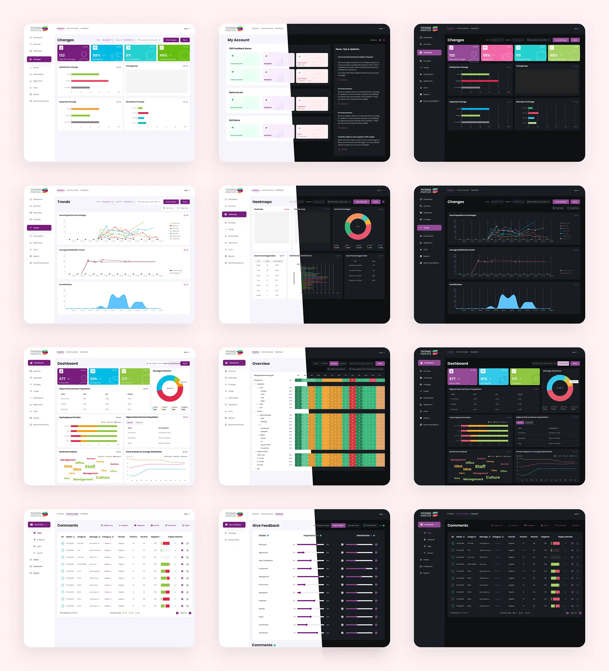
Depending on the prior-planned wireframes and style guidelines, we designed a pixel-perfect dashboard UI in Figma. There we had a great focus on the following factors:

  • Analytics panels that are easy to scan

  • Clear and functional call-to-action buttons

  • Smooth flows for both dark and light themes

As a team we had the goal of making feedback actionable on Thymometrics while keeping the interface simple and engaging.

Validating Ideas Through Prototypes

As a team, we were able to build a fully interactive and highly functional Figma prototype. Next we let the stakeholders as well as the project managers experience the redesign first-hand with the purpose of collecting their feedback.

We had developed the prototype as follows:

  • Clickable flows for ensuring high-level user journeys

  • Rapid incorporation of feedback

  • Fine-tuning of layouts, spacing, and button placement

What We Delivered At The End

At the end of this UI/UX development project, we provided Pixel-perfect Figma files that comprises organized layers and naming conventions. Furthermore, we created interactive prototypes to guide development. Moreover, we embedded consistent, accessible design across dashboards, analytics, and modules

Why Well-executed UI/UX Redesign Matters For Startups?

A perfectly developed UI/UX redesign makes the platform easier to use. Consequently, it encourages people to engage, and supports business growth. Business growth is a critical factor when it comes to startups. 

The following are the key advantages of embedding a high-level UI/UX redesign for any MVP.

Boosting Engagement

An easy-to-navigate UI/UX ensures that employees use the platform more often and more accurately. As a result, trust is built in the system over the time and as an end result data quality improvement takes place.

Speeding Up Launch

Clear and minimal designs help developers build faster with fewer errors. Consequently, the product can reach the market sooner.

Easy-to-Scale

Consistent design makes adding new features simple. There, startups can grow without worrying about breaking the flow.

Enabling Smart Decisions

Dashboards should be clean and clear to the fullest. Such dashboards facilitate easy understanding of data. As a result, managers can make decisions quickly and confidently based on insights.

On the other hand, integration of custom UI design that perfectly aligns with latest web design trends ensures that Thymometrics delivers a user experience that is pretty simple, modern, and actionable.

The Bottom Line

This project thoroughly showcases the value of a focused UX redesign that can transform a SaaS tool into a growth engine. With the UX redesign, Thymometrics was able to enhance the consistent usage of the platform by the employees. Most importantly, the redesign helped a lot to position Thymometrics as a user-centered, future-ready platform. 

If you are a startup founder, it is always wiser to invest in thoughtful and user-focused UX design as it directly strengthens product-market fit to a greater extent.

Results

Outstanding Results

How the New UI worked out

80%

Increase in investments

75%

Increase in user engagement

65%

Increase in user retention

Project image
Project image
Project image
Project image
Project image

Your message has been sent successfully. We will get back to you shortly.

Your message has been sent successfully. We will get back to you shortly.