Revamping a logistics management platform, cutting processing time by over 40%
About the Client.
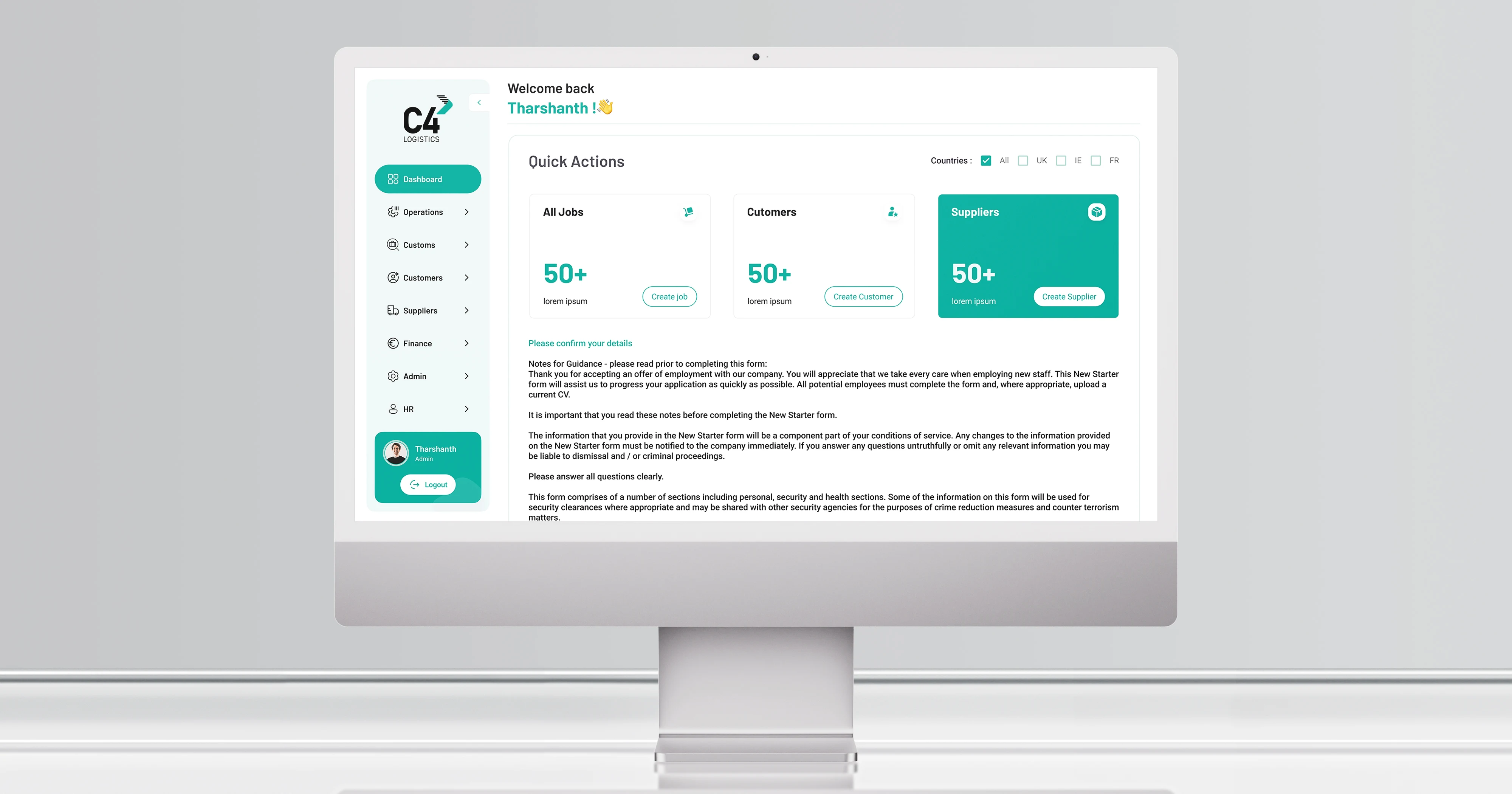
C4 Logistics runs time-critical transport operations across the UK through three interconnected portals: an admin portal for its internal team, a supplier portal for carriers, and a customer portal for transport clients. All three had grown around the business over years rather than being designed for it, and every job, quote, and driver requirement passes through them daily.
03
Months from kick-off to launch326
Screens redesigned across three portals40%+
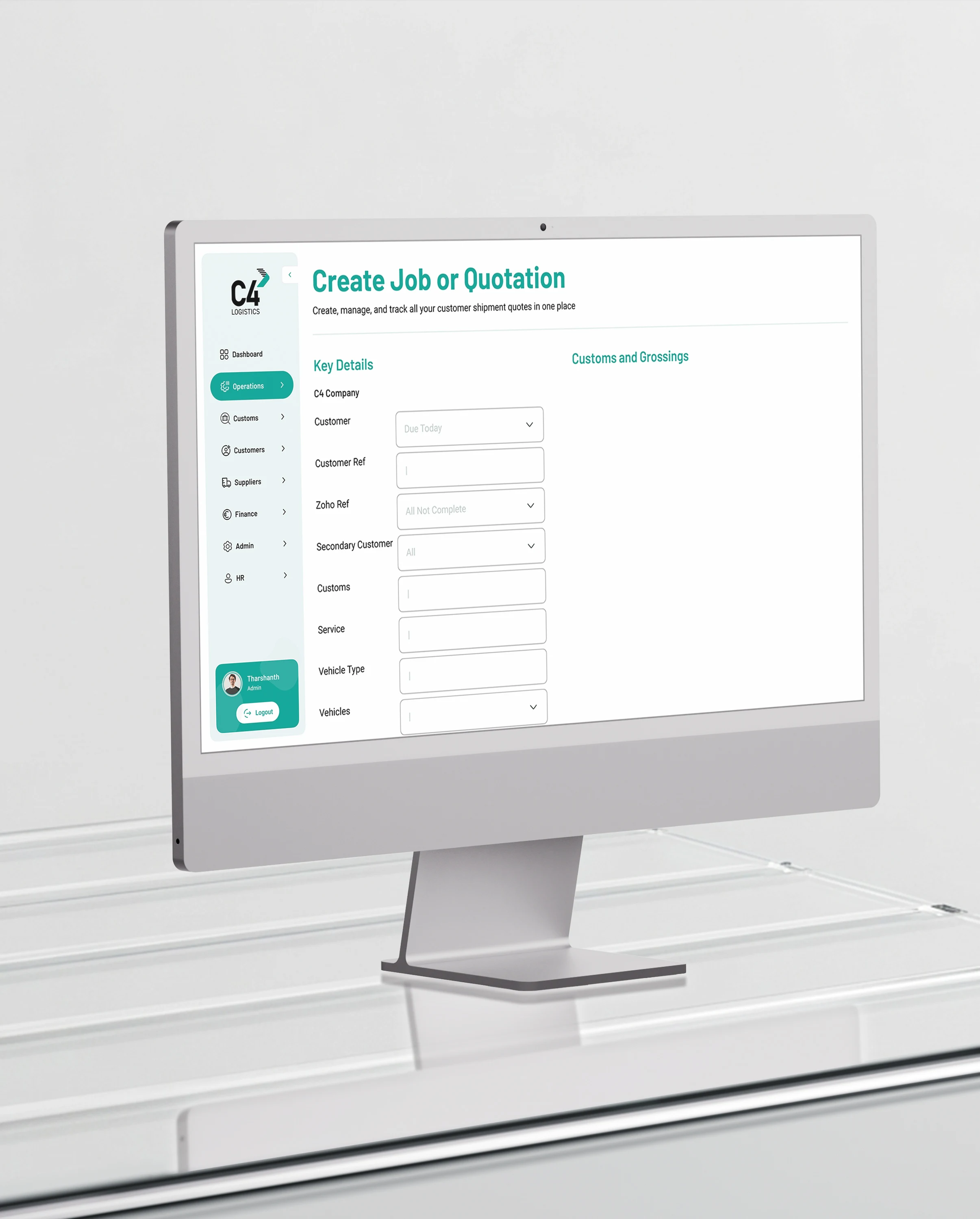
Reduction in processing time for creating jobs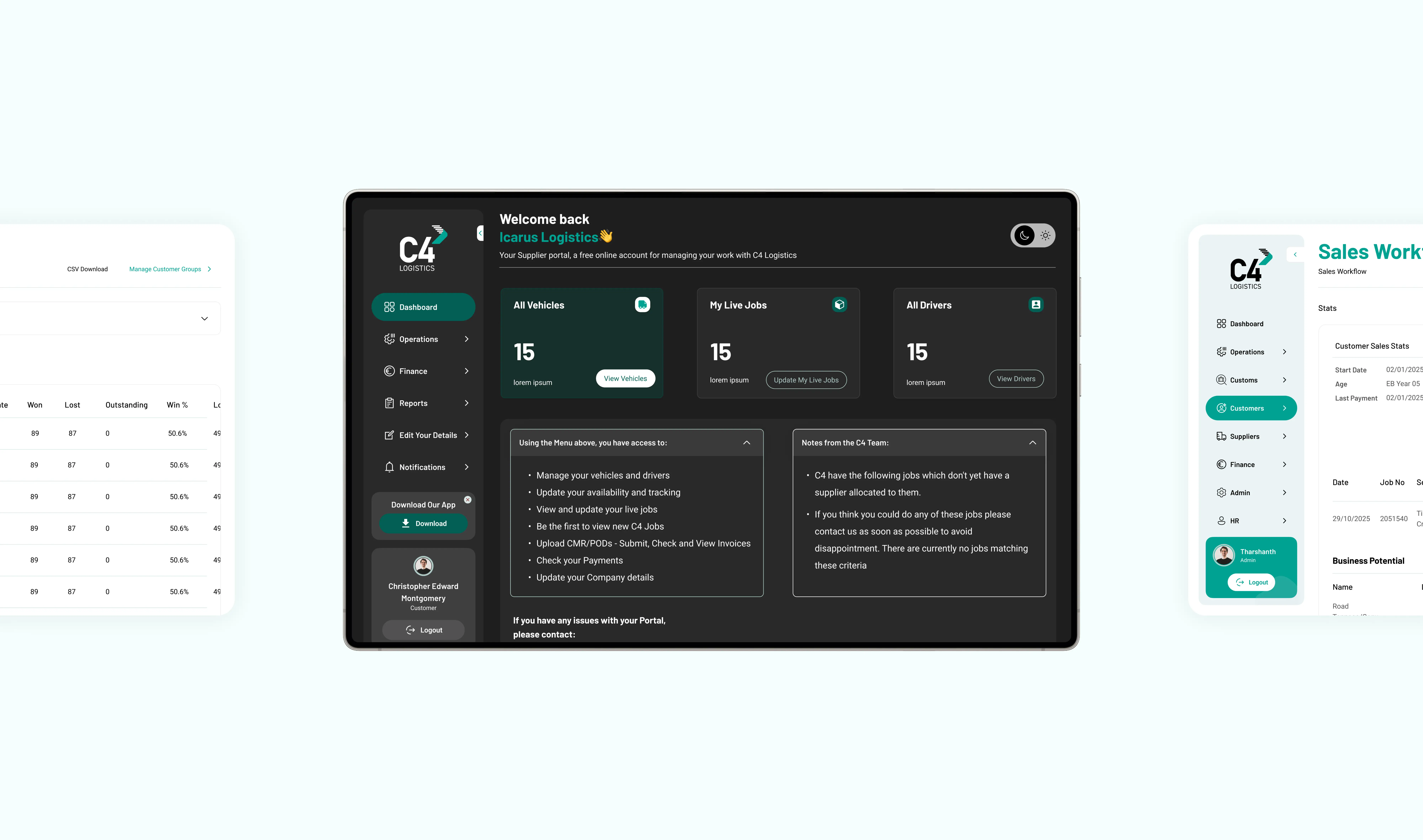
How we approached challenges
01
Fragmented information architecture
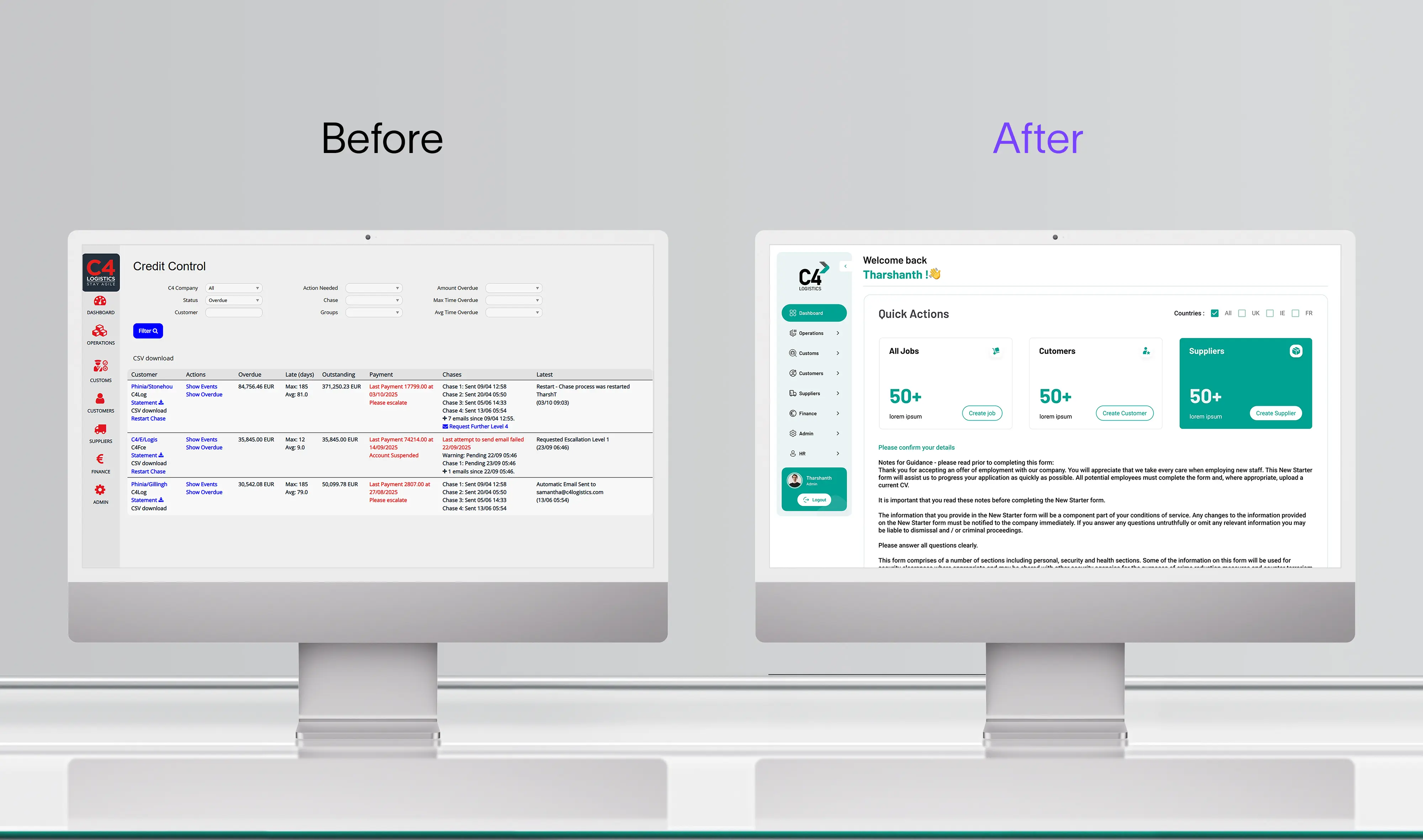
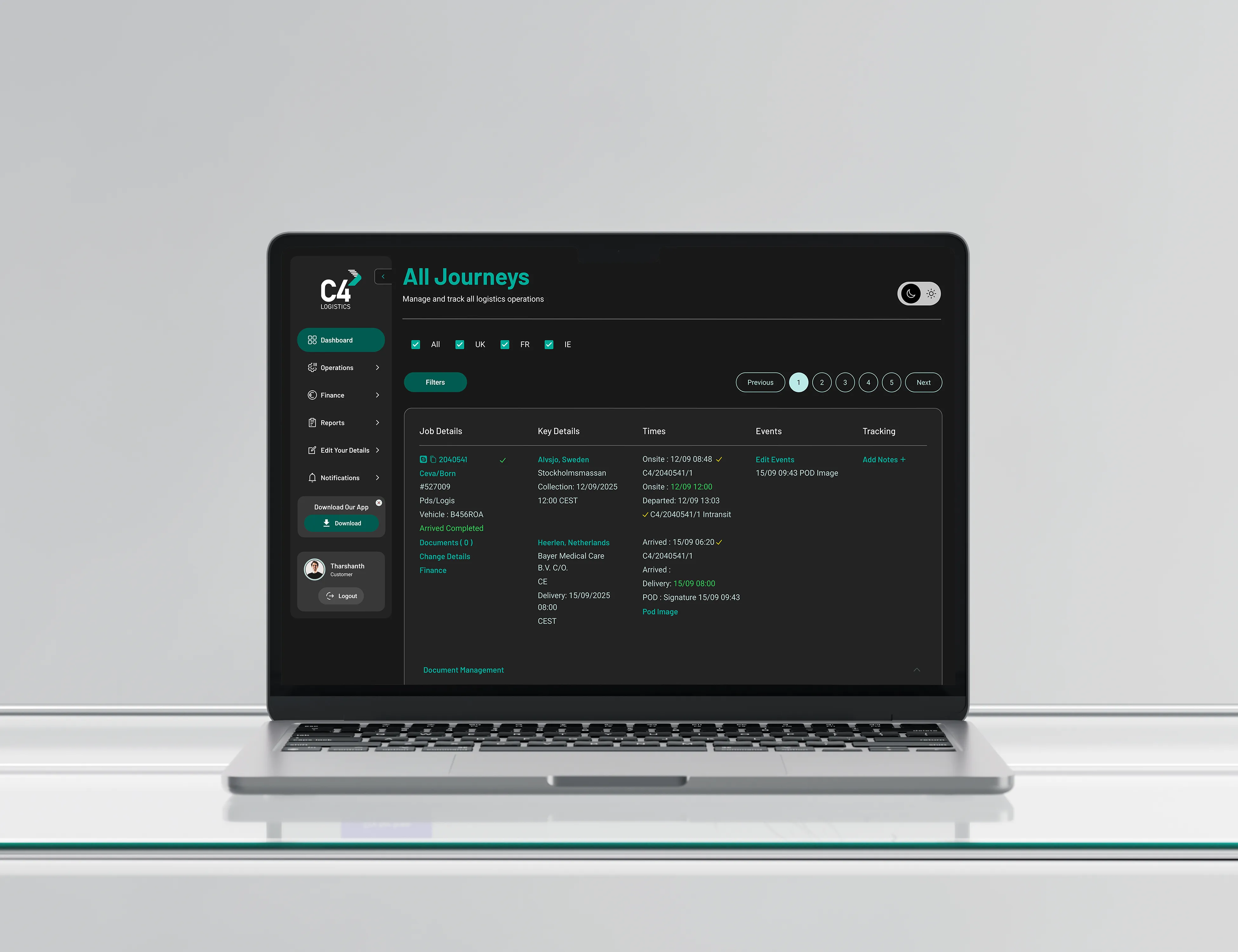
Modules had accumulated without structure, so routine tasks took unnecessary steps. We audited all 326 screens and reorganised them into a sidebar navigation model with logical categories across all three portals.
02
No clear calls to action
Users could not tell what to click first. Stakeholder interviews surfaced it directly: everything on screen was competing for attention. We introduced high-contrast buttons with consistent placement, so the primary action on every screen is unambiguous.
03
A legacy stack with real constraints
The platform runs on ASP.NET Web Forms with sensitive backend logic we could not touch directly. Rather than rebuild, we delivered a reusable component library that developers could implement without disrupting the systems underneath.
04
Poor readability under operational pressure
Staff scan these screens dozens of times a day. We applied WCAG-compliant contrast ratios and typographic weights across every component, so information is legible at speed rather than merely present.
Our process that built a scalable solution
Research before redesign
The brief arrived as a UI refresh. Stakeholder interviews and a heuristic audit across the three portals showed the real problems sat underneath the interface: fragmented architecture, missing actions, and presentation that undercut the company in front of its own customers. The scope changed accordingly, and the redesign became a full overhaul rather than a reskin.
A component system instead of 326 wireframes
Wireframing every screen individually would have taken longer than the project allowed. We built a unified design system first, with typography, colour, CTA styles, dashboards, and sidebar navigation as reusable components, then applied it across the portals. That kept 326 screens consistent and gave the client a system that extends rather than a set of static designs.
Design and engineering in the same loop
Scope stayed unpredictable throughout, with missing screens surfacing during build. Designers sat inside development, designing on demand and participating in QA on every screen. That is what held the three-month timeline without quality dropping at the edges.
Tech stack


What we did
Across the admin portal, job creation, status views, and detail grids were restructured around the sequence the internal team actually follows. The supplier portal was rebuilt around driver requirement management, the task carriers spend most of their time on. The customer portal was simplified to order tracking and profile management, which is nearly all a transport customer needs from it. One design system, three distinct user groups, each with a different job to do.
Result and impact

The effect on sales was less expected. New transport customers described the platform as credible and professional, forming a view of C4's capability before speaking to anyone. Internally, the admin team now presents the portals to prospects and onboards new staff on them without apology. The platform also scaled to accommodate varied permission levels and regional requirements, meeting every success criterion set at kick-off.
The client has kept our team on a monthly retainer since launch, working across several projects.
Frequently asked questions
What is the difference between a UX revamp and a full rebuild?
A revamp changes what users see and how they move through the system, while the underlying code stays in place. A rebuild replaces the code as well. Most platforms that feel outdated do not need a rebuild. C4's portals run on the same backend they always did, and the processing time still fell by over 40%.
How long does a platform revamp take?
C4's three portals and 326 screens took three months from kick-off to launch. A single portal with fewer screens takes less. The variables are the number of distinct user roles, how many screens exist, and how much of the existing architecture survives discovery.
How do you handle a scope that changes during the project?
We expect it on revamp work, because discovery usually finds more than the brief described. On C4, screens surfaced during build that nobody knew existed. Designers sat inside the development cycle and designed on demand rather than pausing to re-scope, which is what held the timeline.
How much does a UX revamp cost in the UK?
Cost follows the number of screens, the number of user roles, and whether we are designing only or designing and building. Every project is quoted with fixed scope and price in writing before work starts.
Can you redesign a platform built on a legacy stack?
Yes, and it is a large part of what we do. C4's portals run on ASP.NET Web Forms with backend logic we could not modify. We delivered a reusable component library that their developers implemented against the existing codebase, so nothing underneath had to change.
Do you work with our existing development team?
Regularly. On a revamp we often handle research, architecture, and design, then hand your developers a documented component library and work alongside them through implementation and QA. If you have no internal team, we handle the build too.
What do we own at the end of the project?
Everything. The design files, the component library, the code, and full administrative access. We train your team on it and stay available if you want us, not because you are locked in.
Got a platform that needs rethinking?

Tharsh Thangavadivel
Founder, Exline LabsTell us what you are building. We will scope it and give you an honest view of the right approach and what it will cost.
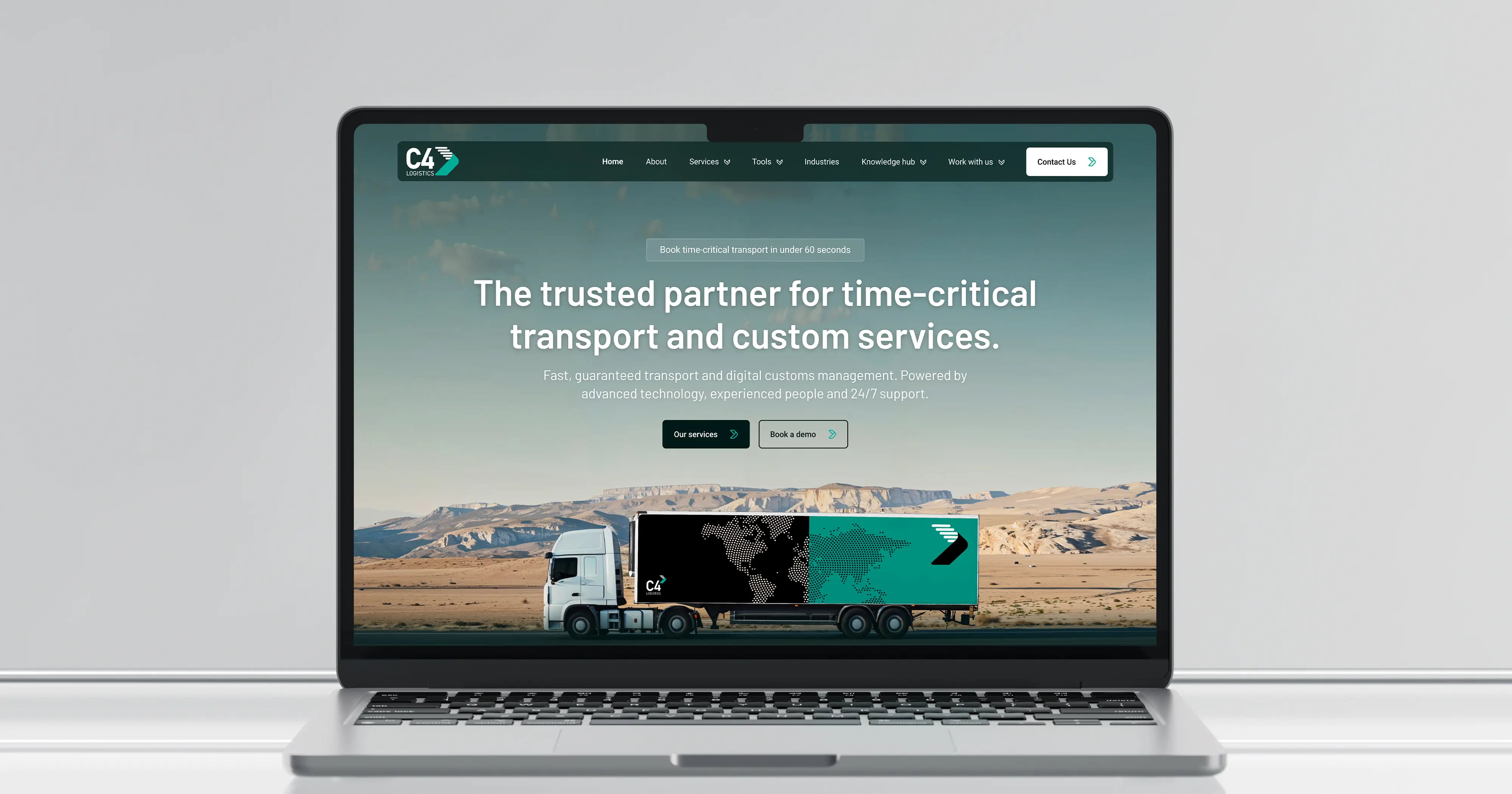
C4 Logistics website redesign
We also redesigned the C4 Logistics public website. See that case study.
Read the case study →