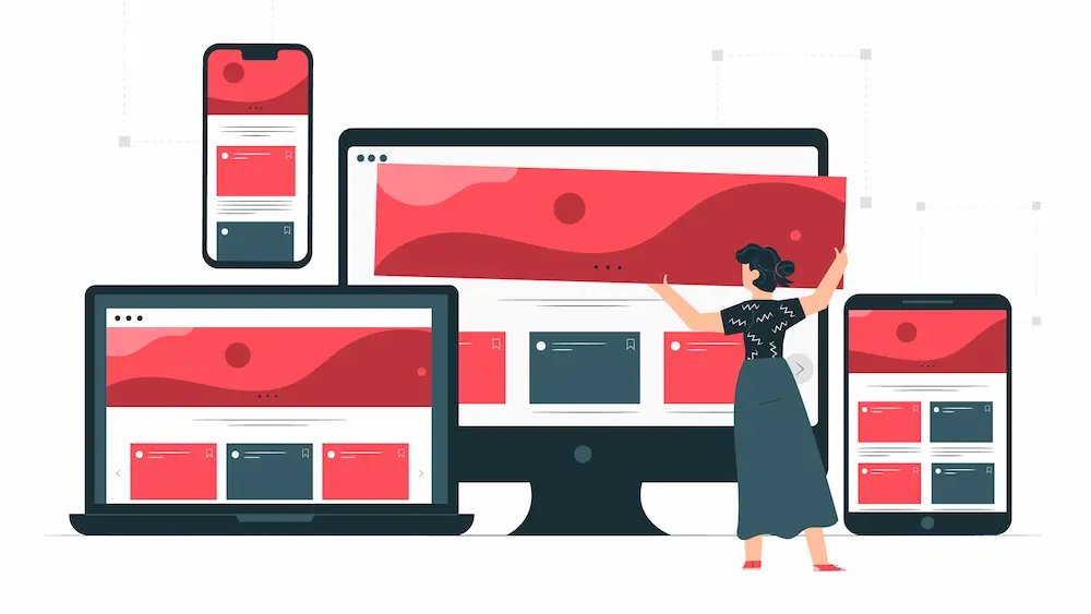
In a world where the web is accessed from an ever-expanding array of devices, ensuring your website looks and works flawlessly on each screen is paramount. Responsive web design (RWD) is the key to achieving this goal. In this article, we’ll explore the essential tools and techniques to harness the full potential of responsive web design with practical examples and code snippets.
Understanding Responsive Web Design
Responsive web design is an approach that allows your website to adapt dynamically to different screen sizes and orientations. Here are some essential concepts:
Fluid Grids
Imagine you’re designing a website with a three-column layout. Instead of specifying fixed pixel widths, you use percentages. For example:
 .column {
width: 33.33%;
}
This ensures that each column occupies one-third of the available space, regardless of the screen size.
Media Queries
Media queries allow you to apply specific CSS rules based on the device’s characteristics. For instance, you can make text larger on smaller screens like this:
 @media screen and (max-width: 768px) {
body {
font-size: 18px;
}
}
Flexible Images
To ensure images scale properly, you can use the max-width: 100%; property:
 img {
max-width: 100%;
height: auto;
}
Essential Tools for Responsive Web Design
1. Bootstrap
Bootstrap is a powerful front-end framework that streamlines the responsive design process. Let’s say you want to create a responsive navigation bar:
|
1
2
3
4
5
6
7
8
9
10
11
12
13
14
15
16
17
18
19
|
<nav class="navbar navbar-expand-lg navbar-light bg-light">
<a class="navbar-brand" href="#">My Website</a>
<button class="navbar-toggler" type="button" data-toggle="collapse" data-target="#navbarNav" aria-controls="navbarNav" aria-expanded="false" aria-label="Toggle navigation">
<span class="navbar-toggler-icon"></span>
</button>
<div class="collapse navbar-collapse" id="navbarNav">
<ul class="navbar-nav ml-auto">
<li class="nav-item active">
<a class="nav-link" href="#">Home</a>
</li>
<li class="nav-item">
<a class="nav-link" href="#">About</a>
</li>
<li class="nav-item">
<a class="nav-link" href="#">Contact</a>
</li>
</ul>
</div>
</nav>
|
Bootstrap’s predefined classes handle the responsive behavior.
2. CSS Grid
CSS Grid offers fine-grained control over layouts. Let’s create a basic responsive grid:
 .container {
display: grid;
grid-template-columns: repeat(auto-fit, minmax(250px, 1fr));
grid-gap: 20px;
}
This code creates a flexible grid where items adjust based on available space.
Practical Scenarios
Imagine you’re designing an e-commerce website. Using responsive design, you can ensure a seamless shopping experience on all devices:
- On small screens, the product list might display one item per row, optimizing mobile browsing.
- On tablets, two or three items per row provide a balance between visibility and space usage.
- On large desktop screens, you can showcase five or more items per row to utilize the available space effectively.
Conclusion
Responsive web design is no longer an option—it’s a necessity. By leveraging tools like Bootstrap and CSS Grid and understanding key concepts like fluid grids and media queries, you can create websites that adapt beautifully to every screen.
Now, go ahead and unleash the power of responsive web design to reach a broader audience and provide an outstanding user experience.
