Redesigning an employee feedback platform, lifting demo bookings by 42%
About the Client.
Thymometrics Limited is a UK company behind Thymo™, an employee feedback and engagement platform that captures real-time insight into employee mood, engagement, and wellbeing. Rather than annual or quarterly surveys, it runs continuous feedback through interactive surveys and analytics. The product was already established and in active use across organisations, which meant the brief was never about capability. It was about an interface that had fallen behind what the platform could do.
03
Months, design through front-end implementation25
Screens redesigned and built, in light and dark mode42%
More demo calls booked after the redesign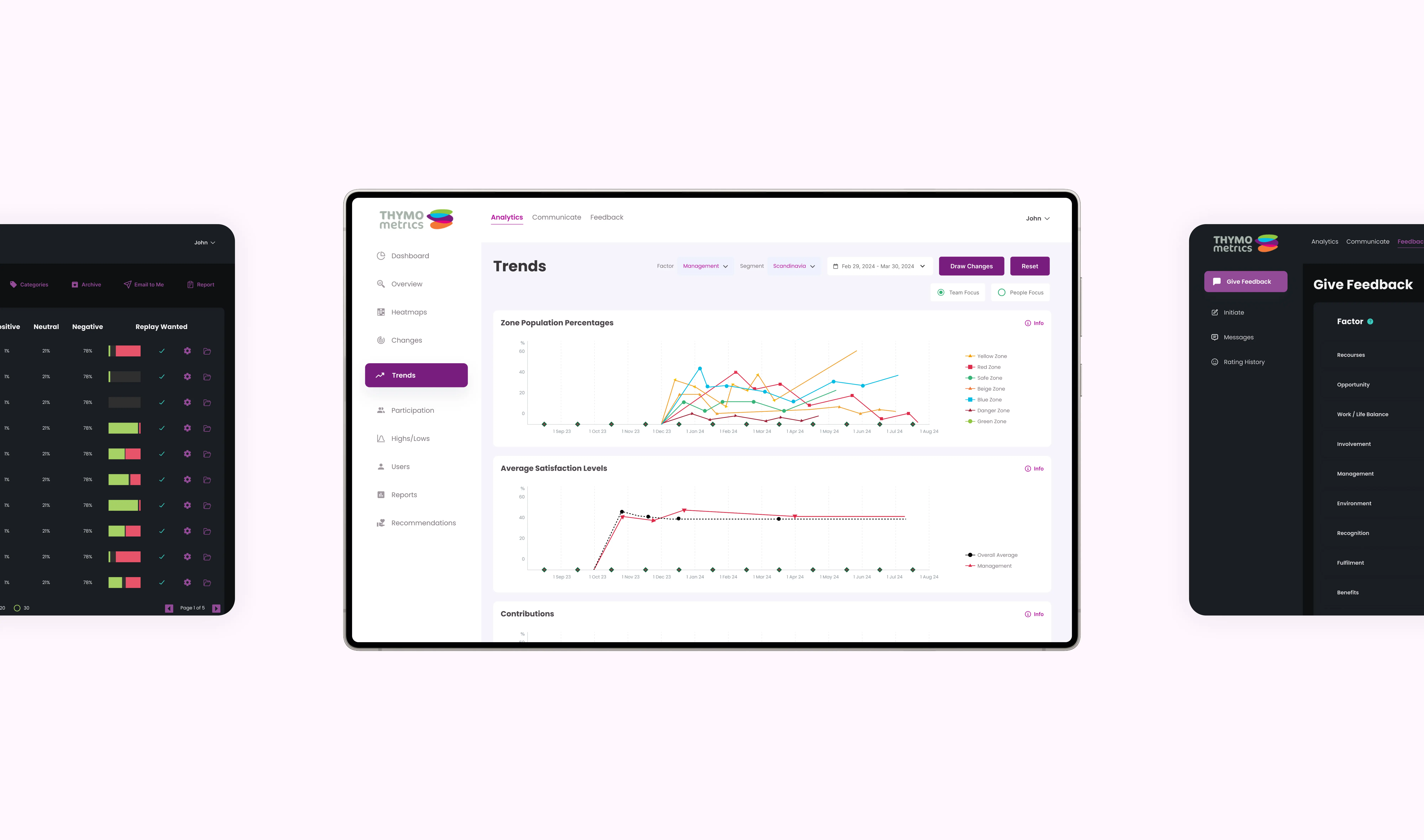
How we approached challenges
01
Dashboards that buried the point
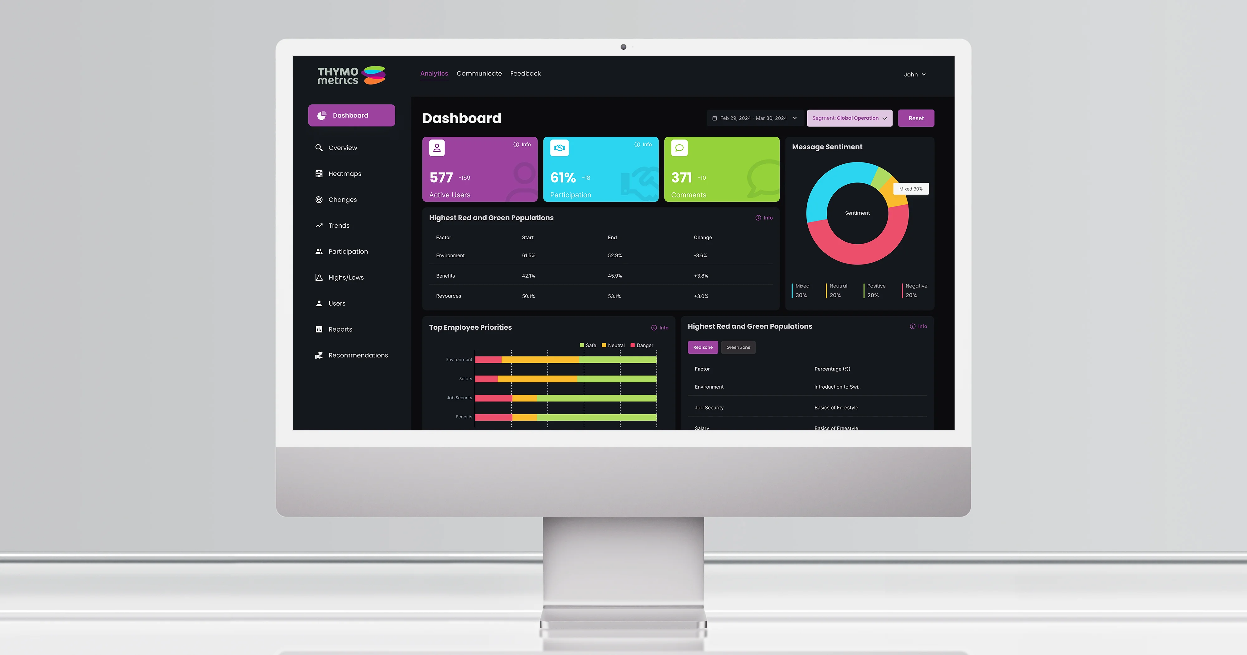
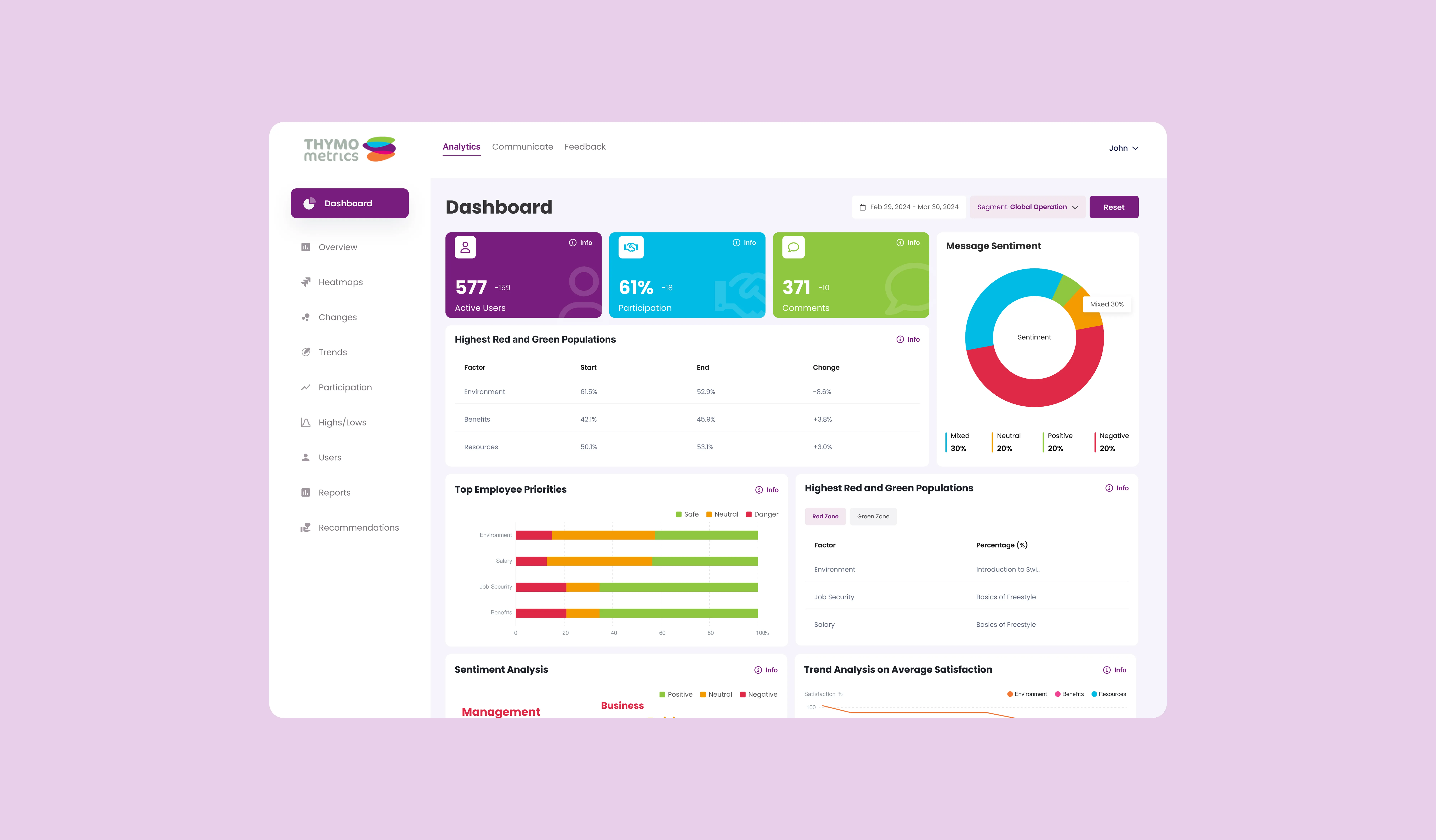
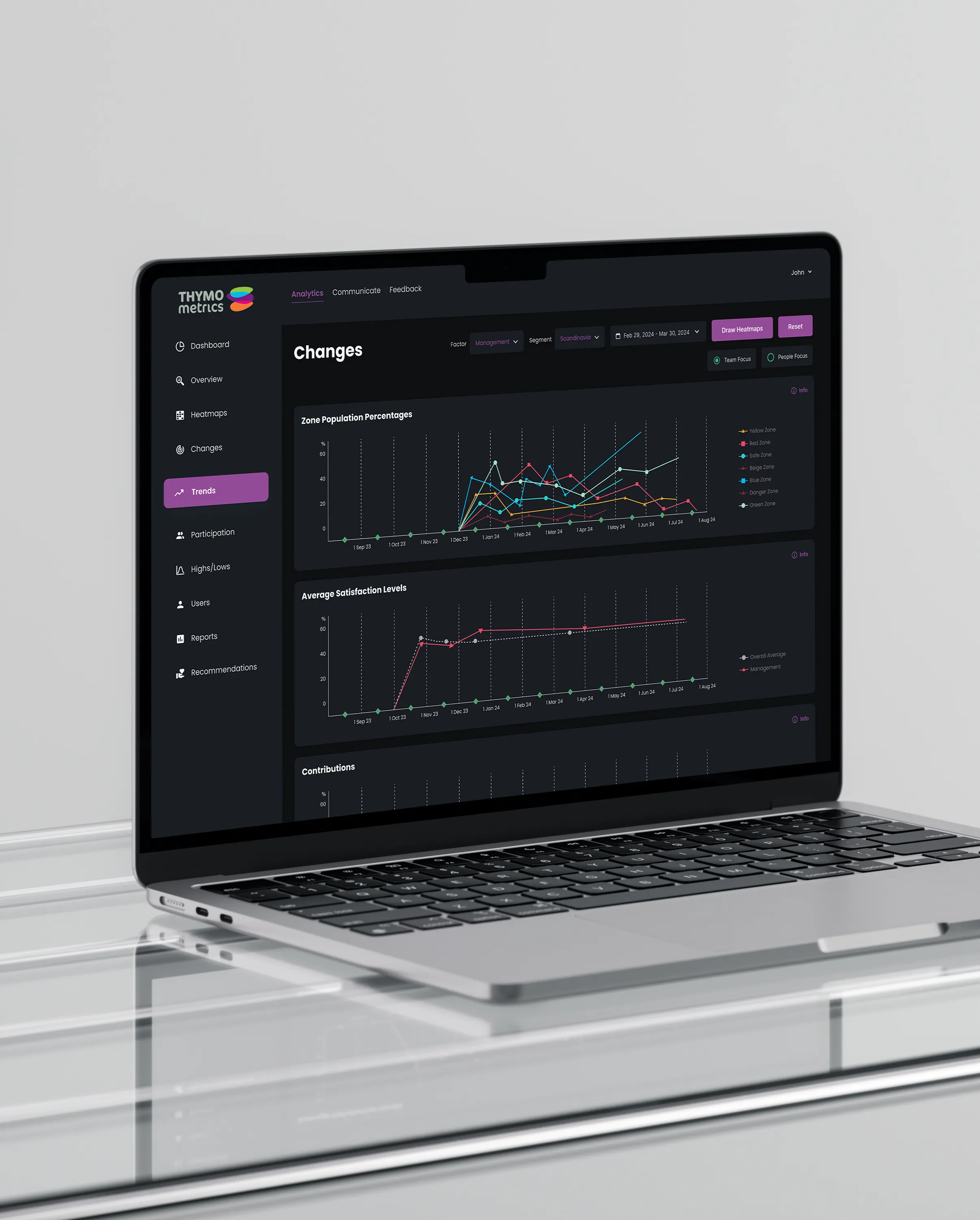
The platform captured a great deal and showed nearly all of it at once, so the figures a manager would act on sat alongside everything else. We rebuilt the hierarchy so the actionable data leads and the supporting detail sits underneath it.
02
Patterns that changed between modules
Interaction and visual patterns differed across the product, so familiarity never accumulated and users second-guessed themselves in places they had already been. A single set of patterns now runs across every module.
03
Navigation organised by structure, not by task
Routine work took longer than it should because the menus reflected how the product was built rather than what people came to do. Navigation was reorganised around tasks, which shortened the paths users walk most often.
04
Accessibility, and dark mode as a real requirement
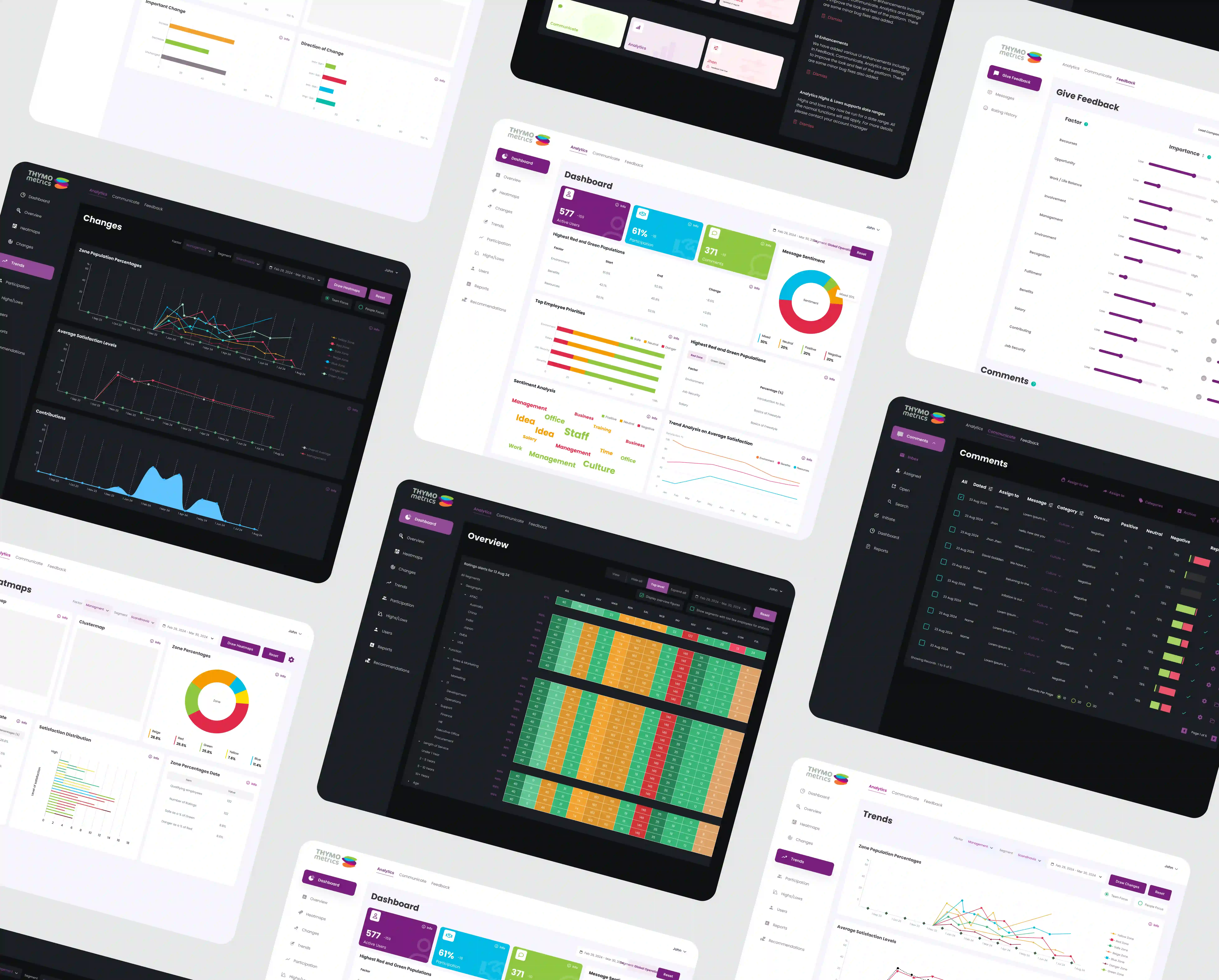
Accessibility gaps limited how equally different user groups could engage with the product. Every one of the 25 screens was designed and implemented in both light and dark mode, with contrast holding up in each, rather than dark mode arriving later as an inverted afterthought.
Our process that built a scalable solution
Understanding use before redesigning screens
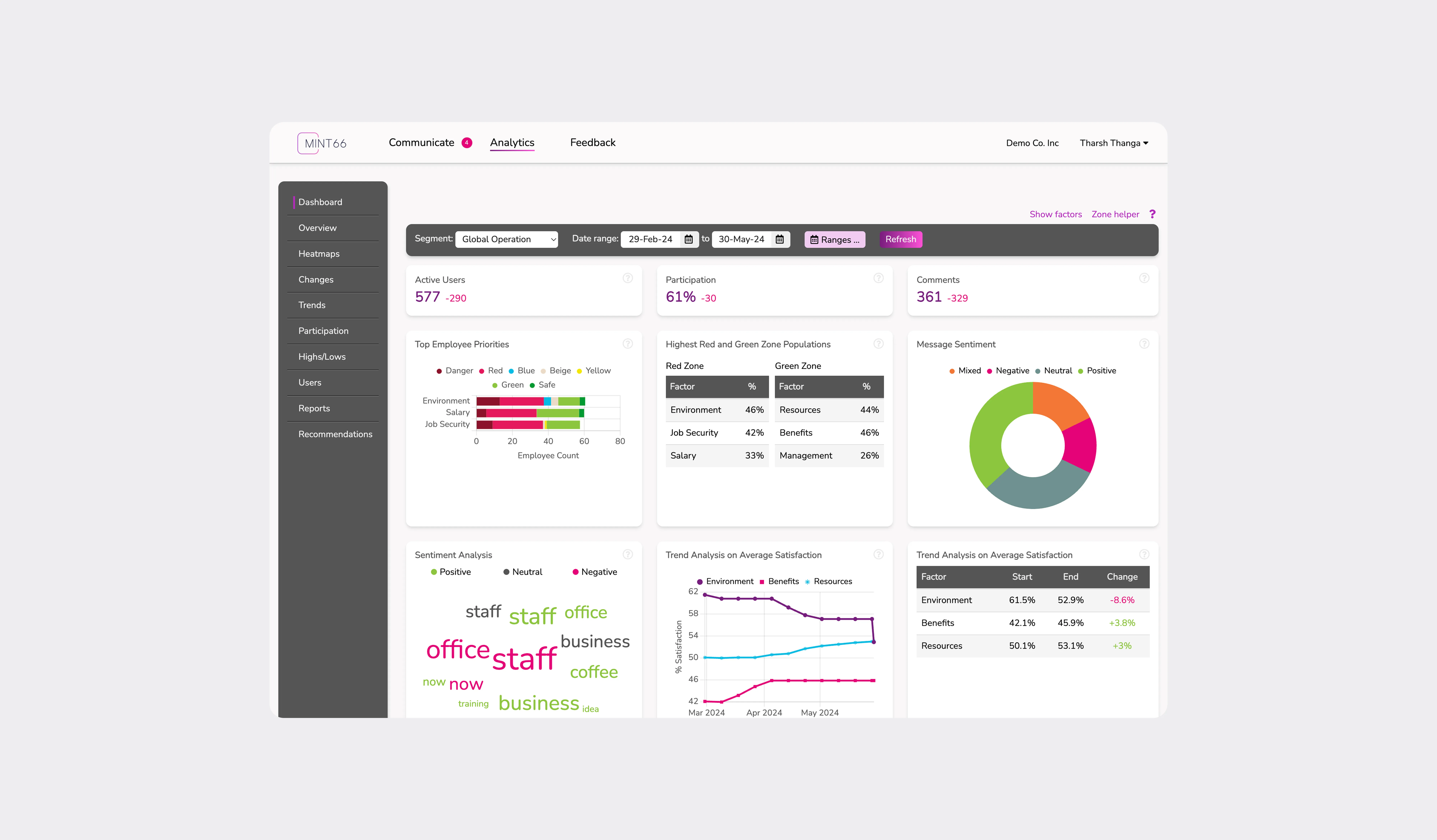
We reviewed the existing product in detail before touching anything, then ran competitor analysis across direct and indirect HR tech platforms to establish what users of this category already expect from dashboard clarity, navigation, and data hierarchy. On a mature product with real users, assumptions are the expensive mistake.
Wireframes validated before high-fidelity design
Low-fidelity wireframes mapped the user journeys and tested the restructured navigation while it was still cheap to change. Structure was signed off before visual design began, which is why the implementation month held.
An embedded designer, then an embedded developer
This ran as an extended team engagement rather than a fixed-scope project. A UX and UI designer embedded in the Thymometrics team for the redesign, then a front-end developer embedded to implement it. Both worked inside the client's own process, so decisions were made in the room rather than exchanged over email, and the client kept control throughout.
Tech stack

What we did
The engagement ran as an embedded team. A designer joined Thymometrics for two months to research, restructure, and design, producing a component library and style guide alongside the screens. A front-end developer then embedded for a further month to implement the designs in ASP.NET and Blazor against the client's existing platform. One team, sequential rather than handed over, which is why the implementation matched the design rather than approximating it.
Result and impact
For the users already on the platform, dashboards became clearer and navigation more predictable, and confusion during routine tasks dropped. None of the product's capability changed. What changed is how much of that capability a manager can reach without effort, which is usually the difference between a platform people tolerate and one they rely on.
Frequently asked questions
Can you redesign our product without rebuilding it?
Yes, and it is usually the right call on a mature product. Thymo's capability did not change. We restructured the hierarchy, the patterns, and the navigation, then implemented the front end against the existing platform. Everything behind it stayed as it was.
How does an embedded designer or developer actually work?
They join your team and your process rather than working at arm's length from ours. On Thymometrics, a designer embedded for two months and a front-end developer for one, both working inside the client's own cadence. Every placement starts with a one-month trial.
Do you design for dark mode as well?
When it matters to your users, yes, and from the start rather than afterwards. All 25 Thymo screens were designed and implemented in light and dark mode, with contrast checked in both. Retrofitting dark mode onto a light-mode design is where most products end up with a version that technically works and nobody uses.
How do you improve usability on a product that already has live users?
By finding out how it is genuinely used before changing anything. We reviewed the product in detail and analysed competing platforms to establish what users of the category already expect, then validated the restructured navigation in wireframes before any visual work. On a live product, guessing costs more than research.
How do you measure whether a redesign worked?
Agree what you are measuring before starting. For Thymometrics the measure was commercial, and demo bookings rose by 42%. For an internal platform it might be task completion time. A redesign with no agreed measure is a matter of opinion afterwards.
Who implements the designs, us or you?
Either. Thymometrics chose to have our front-end developer embed and implement, which is why the build matched the design. If your own team implements, you get a documented component library and style guide, and we stay available through implementation and QA.
How long does a UX redesign take?
Thymo's 25 screens took two months to design and one to implement. The variables are the number of screens, the number of user roles, and whether light and dark themes are both required.
Can you redesign our product without rebuilding it?
Yes, and it is usually the right call on a mature product. Thymo's capability did not change. We restructured the hierarchy, the patterns, and the navigation, then implemented the front end against the existing platform. Everything behind it stayed as it was.
Do you design for dark mode as well?
When it matters to your users, yes, and from the start rather than afterwards. All 25 Thymo screens were designed and implemented in light and dark mode, with contrast checked in both. Retrofitting dark mode onto a light-mode design is where most products end up with a version that technically works and nobody uses.
How do you measure whether a redesign worked?
Agree what you are measuring before starting. For Thymometrics the measure was commercial, and demo bookings rose by 42%. For an internal platform it might be task completion time. A redesign with no agreed measure is a matter of opinion afterwards.
How long does a UX redesign take?
Thymo's 25 screens took two months to design and one to implement. The variables are the number of screens, the number of user roles, and whether light and dark themes are both required.
How does an embedded designer or developer actually work?
They join your team and your process rather than working at arm's length from ours. On Thymometrics, a designer embedded for two months and a front-end developer for one, both working inside the client's own cadence. Every placement starts with a one-month trial.
How do you improve usability on a product that already has live users?
By finding out how it is genuinely used before changing anything. We reviewed the product in detail and analysed competing platforms to establish what users of the category already expect, then validated the restructured navigation in wireframes before any visual work. On a live product, guessing costs more than research.
Who implements the designs, us or you?
Either. Thymometrics chose to have our front-end developer embed and implement, which is why the build matched the design. If your own team implements, you get a documented component library and style guide, and we stay available through implementation and QA.
Got a product that deserves a better interface?

Tell us what is not working. We will review it and give you an honest view of whether it needs a redesign, a rebuild, or neither.
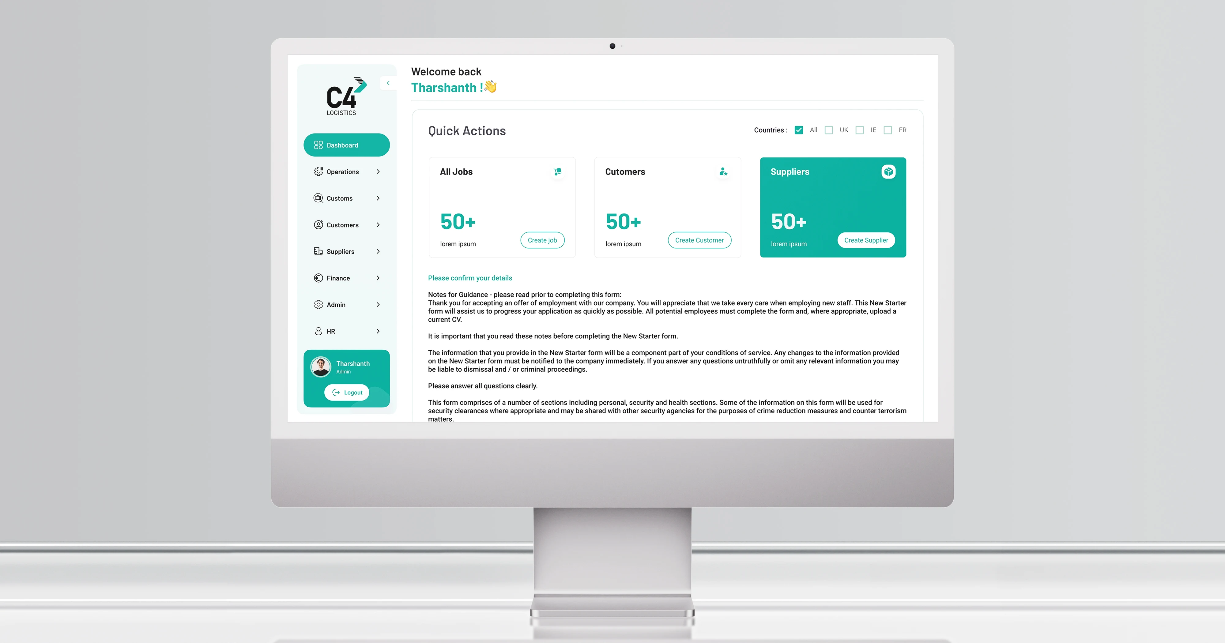
C4 Logistics platform revamp
Another redesign delivered inside an existing system. See that case study.
Read the case study →