Redesigning a yacht management platform, cutting form completion time by 65%
About the Client.
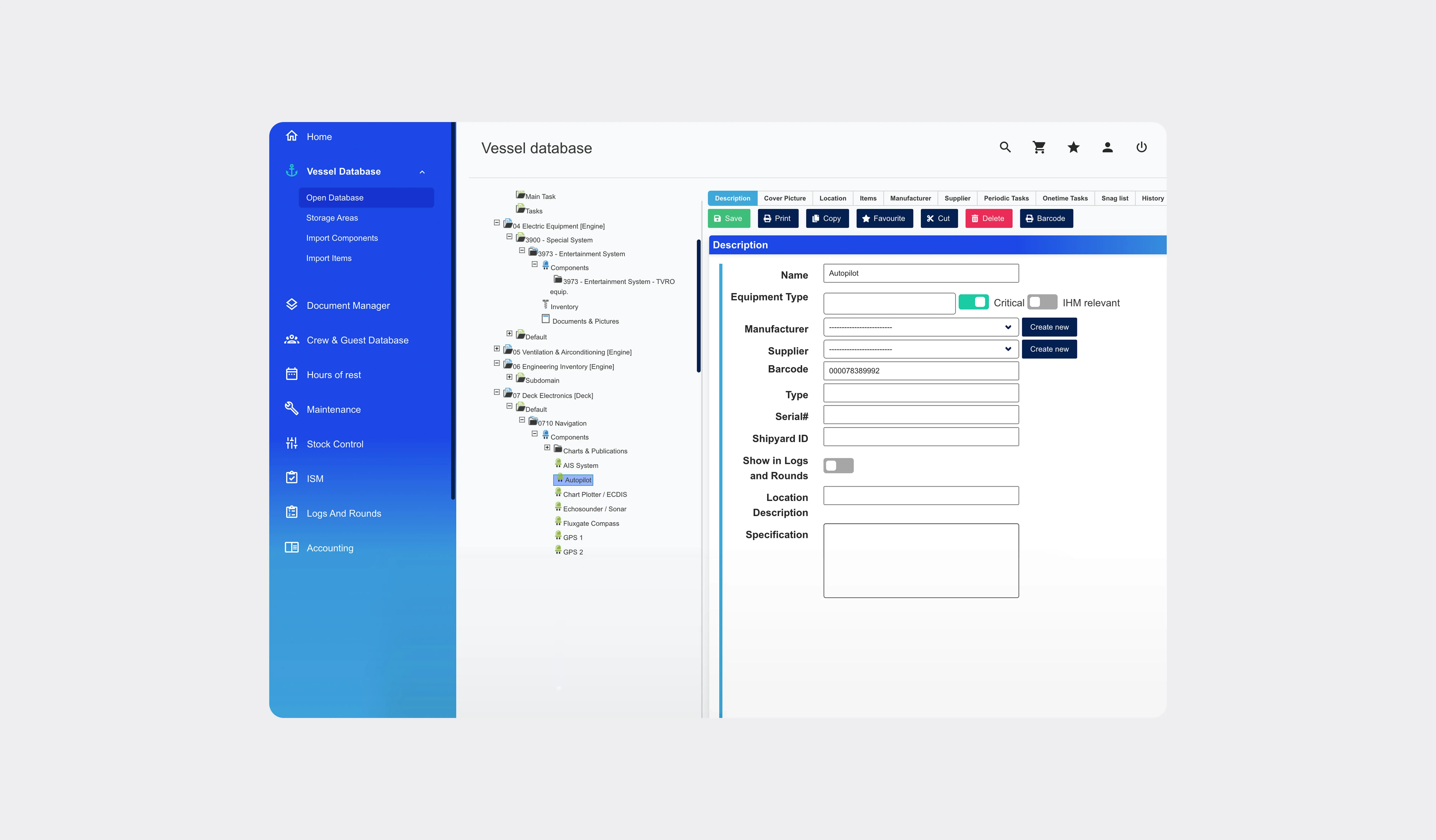
IDEA Data Solutions GmbH has spent over 20 years building yacht management software for superyacht owners, captains, and fleet operators worldwide. Its platform, IDEA Yacht, runs maintenance tracking, safety compliance, crew management, inventory, and financial reporting. The Vessel Database sits at the centre of it. Functionally it was never in question. It had simply aged, and the people using it every day were paying for that in time and mistakes.
02
Months from kick-off to delivery60
Screens designed across two core modules65%
Reduction in form completion time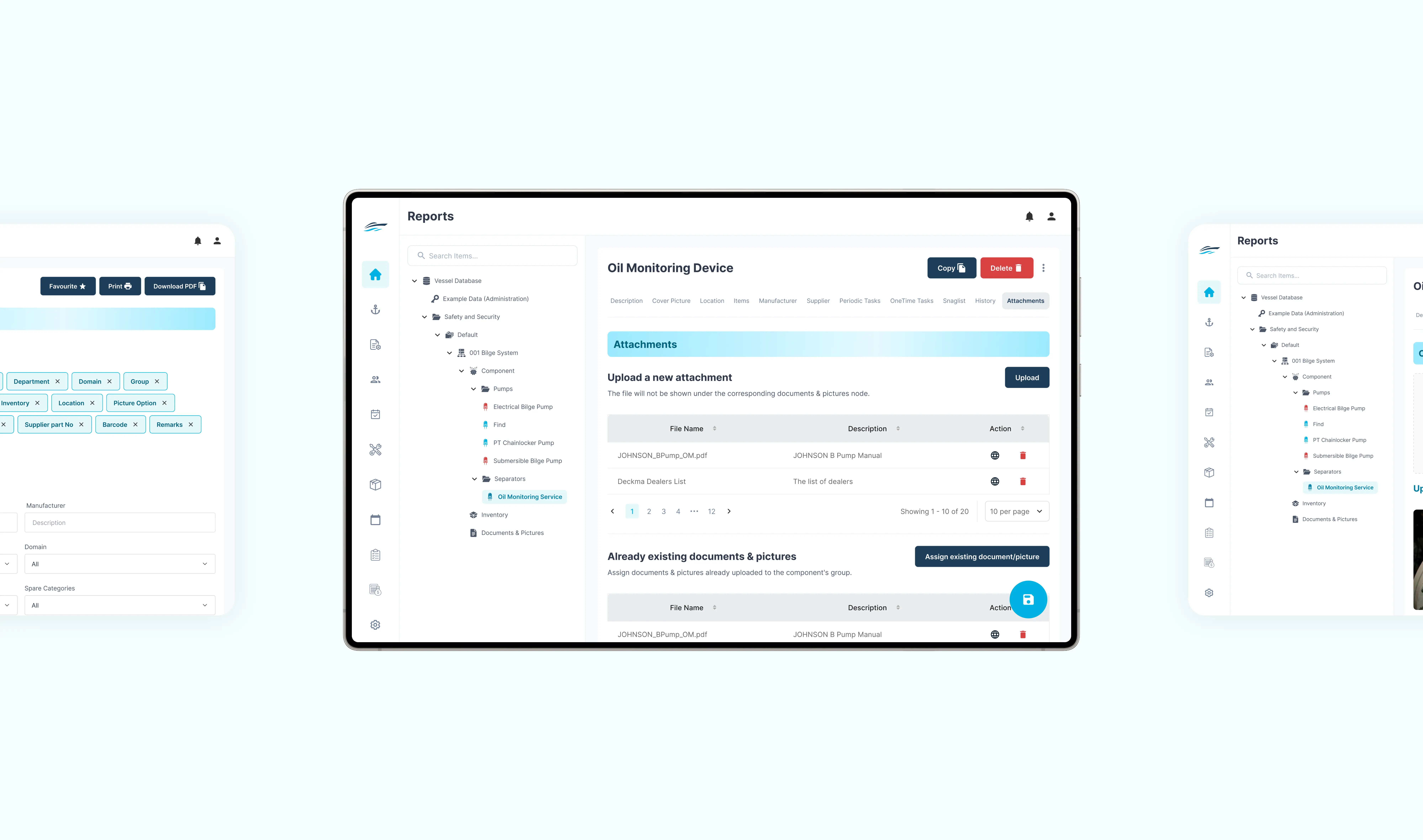
How we approached challenges
01
Forms that slowed down daily work
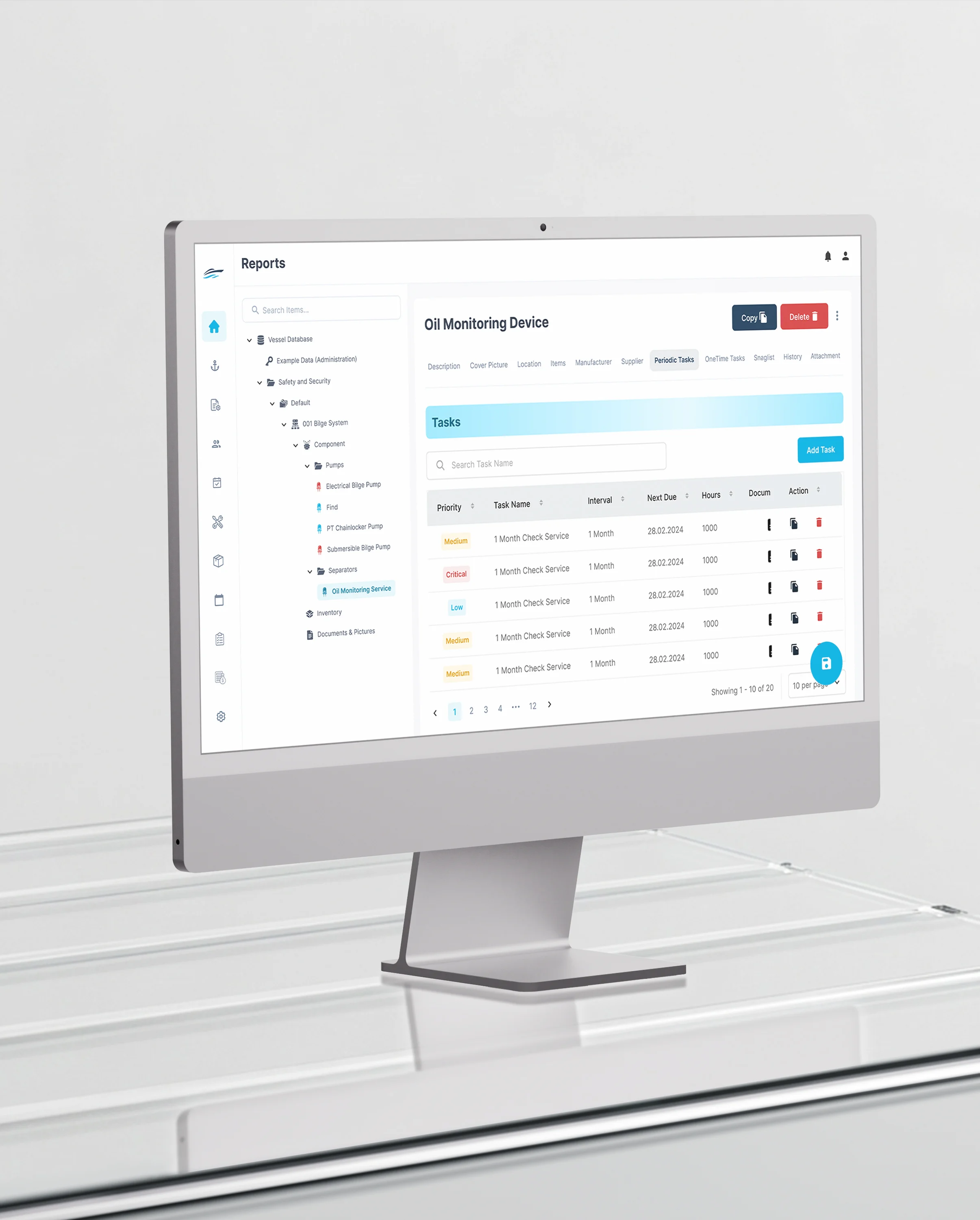
Crews, managers, and finance teams complete the same form-heavy screens repeatedly, so every unnecessary field and ambiguous label costs time many times over. We rebuilt those flows to be quick to complete and, more importantly, hard to get wrong.
02
Navigation organised around the system, not the task
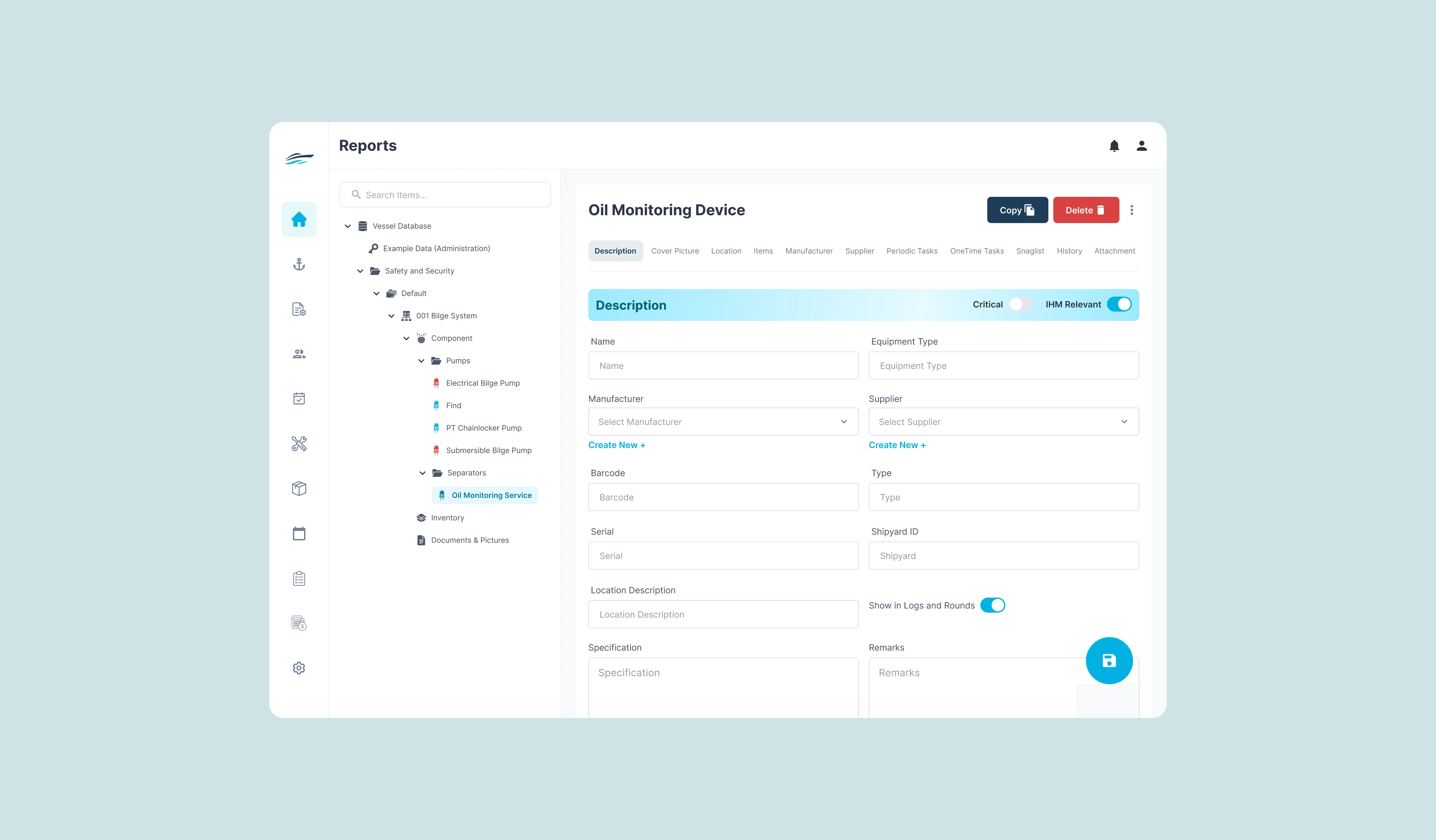
The menus reflected how the platform had been built rather than how the work is done. We reorganised navigation around real operational tasks, so the path through the product matches the sequence of a user's day.
03
Layouts that changed between modules
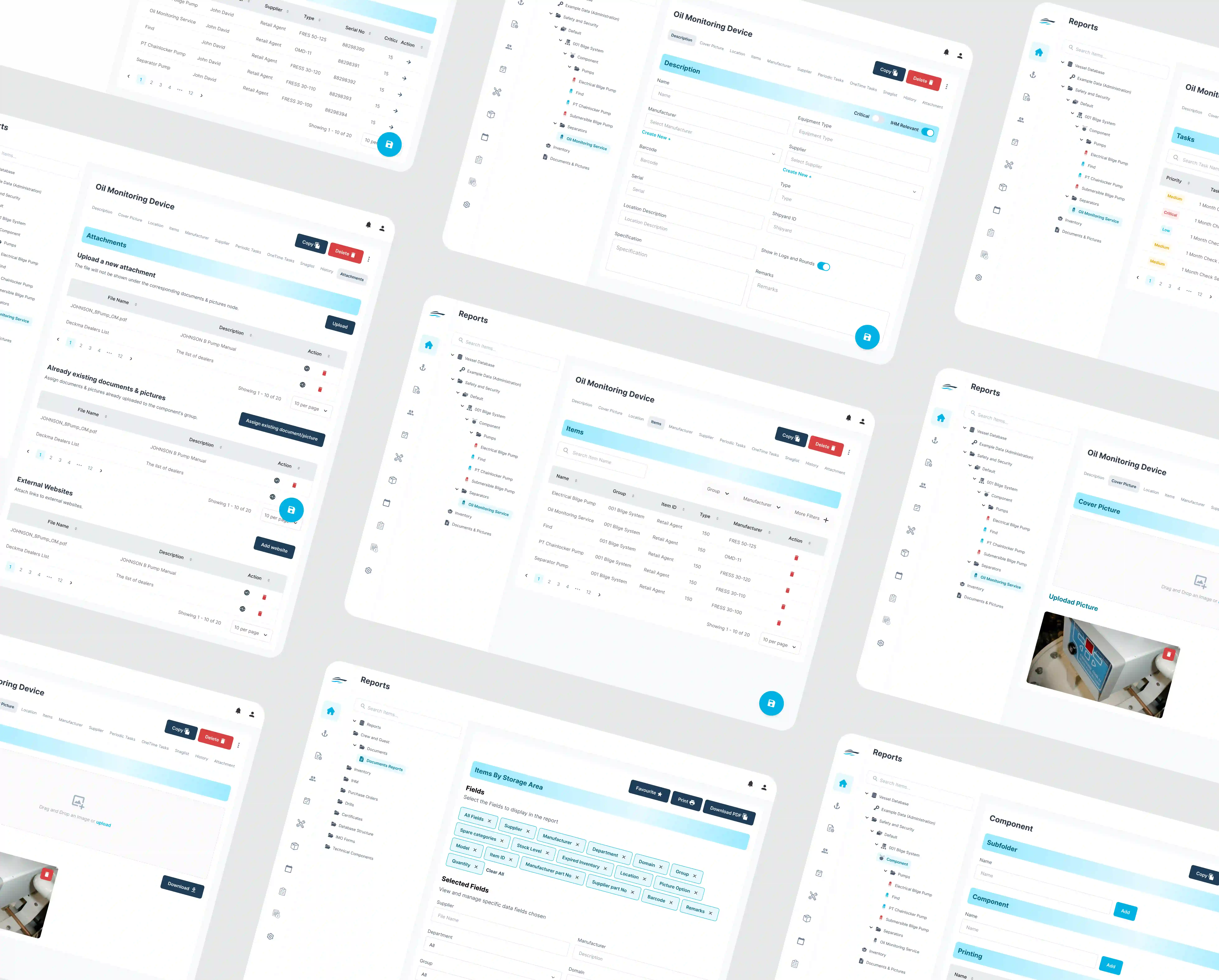
Inconsistent patterns across modules meant familiarity never accumulated and users hesitated in places they had already been. One standardised set of buttons, fields, tables, modals, and navigation now runs across the platform.
04
Reporting that was hard to scan
Financial and operational reports were difficult to read and compare at a glance, which is most of what a report is for. We reduced the visual load in the data tables and summaries so figures can be compared without being deciphered.
Our process that built a scalable solution
Research with three distinct user groups
We ran workshops and journey mapping with the client's leadership and its core user groups: yacht managers, crew administrators, and finance teams. The purpose was to find the exact points where users hesitated, made errors, or lost time. On a platform this established, that evidence is the only reliable basis for changing anything.
Information architecture rebuilt around the flow of work
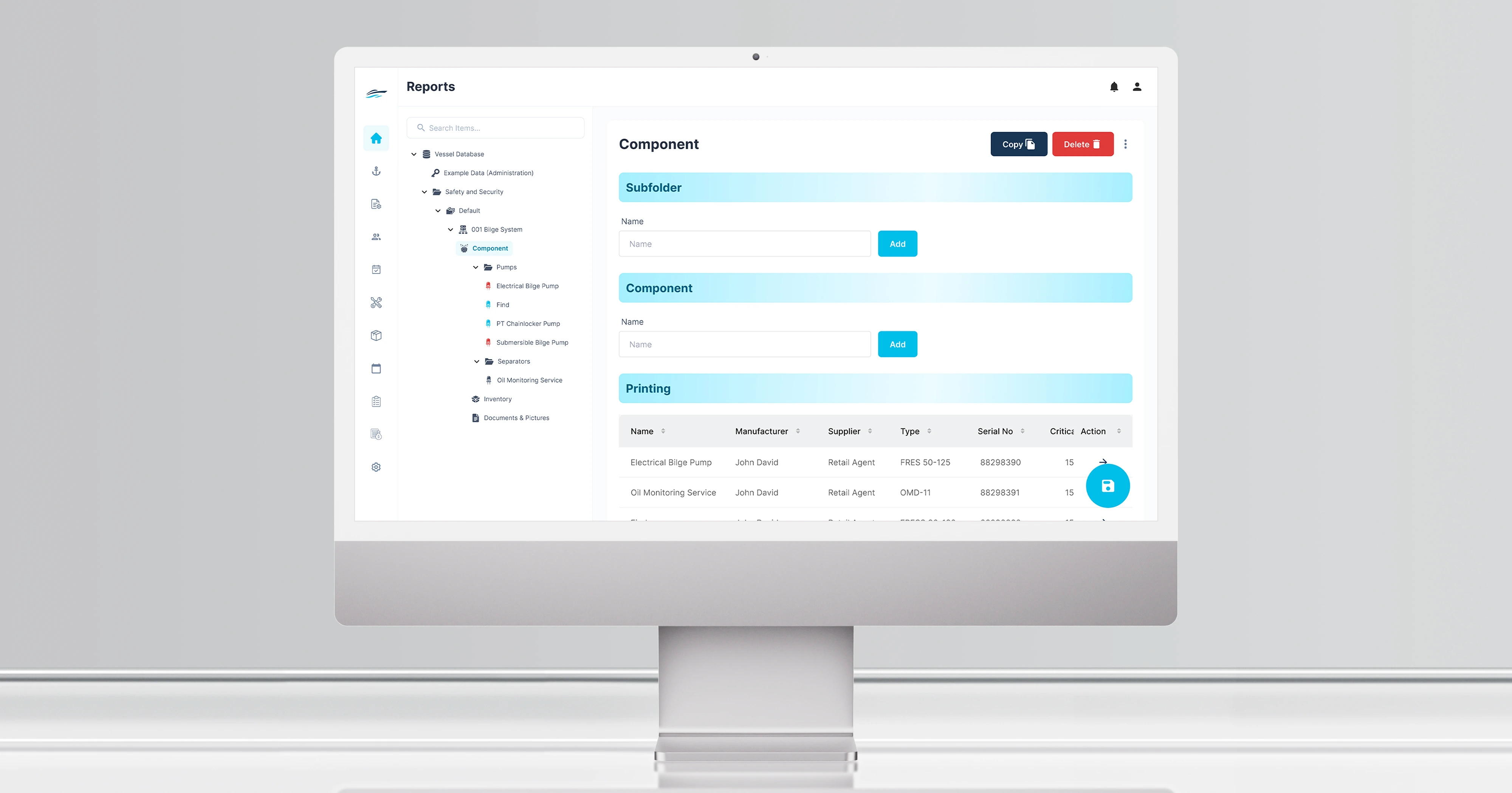
The Vessel Database was restructured so tasks move in sequence from entering vessel details through review and approval to financial reporting, without navigation jumps in between. Form-heavy areas such as expenses, revenue proposals, and approvals were laid out to reduce both effort and error.
A design system built to extend beyond the brief
The client's requirement was not one better module but a coherent platform. We built a scalable design system covering buttons, inputs, tables, modals, and navigation, with responsive layouts and the client's own brand assets integrated, so the remaining modules can be brought into line without a fresh redesign each time.
Tech stack

What we did
Alongside the module, we delivered a design system for the whole platform. Buttons, input fields, tables, modals, and navigation were standardised, responsive layouts added, and the client's brand assets built in, so the product reinforces the company's identity rather than sitting apart from it. The system is what lets IDEA extend the redesign across the remaining modules at a fraction of the cost of the first two.
Result and impact
The longer-term result is the design system. IDEA came to us wanting modules fixed and a foundation that would not need redesigning again, and the second part is what they have. New modules can be brought into the system with minimal design effort, which means the value of this engagement keeps being realised after it ended. The client has said they expect to work with us again.
We received a design concept for a complex master/detail page with many layers and subpages. Exline Labs exhibited exceptional support by consistently providing prompt suggestions and elucidating the rationale behind their decisions. We are extremely pleased with the outcome and would highly recommend Exline Labs. We are confident that we will collaborate with them in the future.
Frequently asked questions
Can you redesign part of a platform without redesigning all of it?
Yes, and it is often the sensible way to start. IDEA engaged us for two of its core modules, 60 screens in total, and we delivered a design system alongside them so the remaining modules can follow at lower cost. Starting with the modules that carry the most daily use proves the approach before the whole platform is committed.
What is a design system and why does it matter on an established product?
It is a standardised set of components, buttons, inputs, tables, modals, navigation, that every screen is built from. On a mature platform it matters because inconsistency between modules is what makes software feel unreliable, and because it removes the need to redesign from scratch each time the product grows.
Do you work with clients outside the UK?
Yes. IDEA Data Solutions is based in Germany. We work UK business hours as standard, which overlaps the European working day almost entirely.
How do you redesign a product used daily for critical operations?
By researching before changing anything. We ran workshops and journey mapping with three separate user groups to find where people hesitated, made errors, or lost time. On a platform handling safety compliance and financial reporting, guessing is not an acceptable method.
How do you make forms faster to complete?
By removing what is not needed and arranging what is left in the order the work happens. Beyond speed, the aim on high-frequency screens is making them hard to misuse, because an error corrected later costs far more than a few seconds saved.
Do we get the design system, or just the screens?
Both, with the component library and style guide documented so your own team can extend them. IDEA's system was built specifically so the modules we did not touch could be brought into line without us.
How much does a UX redesign cost?
Cost follows the number of screens, the number of user groups to research, and whether a design system is part of the scope. Every project is quoted with fixed scope and price in writing before work starts.
Can you redesign part of a platform without redesigning all of it?
Yes, and it is often the sensible way to start. IDEA engaged us for two of its core modules, 60 screens in total, and we delivered a design system alongside them so the remaining modules can follow at lower cost. Starting with the modules that carry the most daily use proves the approach before the whole platform is committed.
Do you work with clients outside the UK?
Yes. IDEA Data Solutions is based in Germany. We work UK business hours as standard, which overlaps the European working day almost entirely.
How do you make forms faster to complete?
By removing what is not needed and arranging what is left in the order the work happens. Beyond speed, the aim on high-frequency screens is making them hard to misuse, because an error corrected later costs far more than a few seconds saved.
How much does a UX redesign cost?
Cost follows the number of screens, the number of user groups to research, and whether a design system is part of the scope. Every project is quoted with fixed scope and price in writing before work starts.
What is a design system and why does it matter on an established product?
It is a standardised set of components, buttons, inputs, tables, modals, navigation, that every screen is built from. On a mature platform it matters because inconsistency between modules is what makes software feel unreliable, and because it removes the need to redesign from scratch each time the product grows.
How do you redesign a product used daily for critical operations?
By researching before changing anything. We ran workshops and journey mapping with three separate user groups to find where people hesitated, made errors, or lost time. On a platform handling safety compliance and financial reporting, guessing is not an acceptable method.
Do we get the design system, or just the screens?
Both, with the component library and style guide documented so your own team can extend them. IDEA's system was built specifically so the modules we did not touch could be brought into line without us.
Got a platform that has aged faster than its capability?

Tell us what is slowing your users down. We will review it and give you an honest view of whether it needs a module fixed, a design system, or something else entirely.
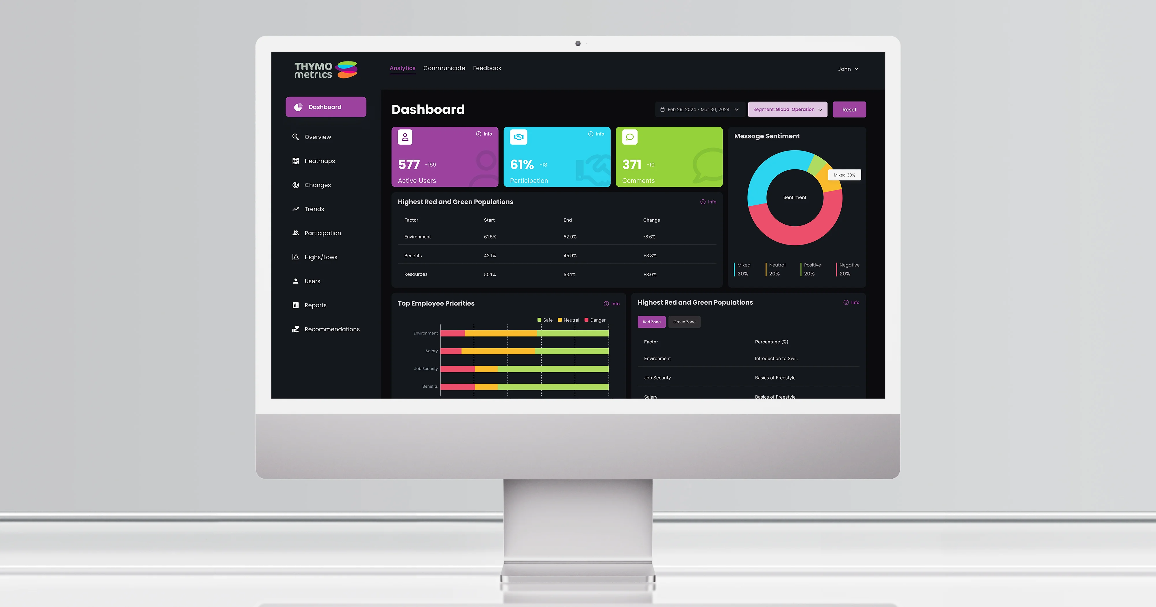
Thymometrics UX redesign
Another established SaaS product redesigned without changing what it does. See that case study.
Read the case study →