Designing a P2P car rental marketplace in one month, from research to a funded launch
About the Client.
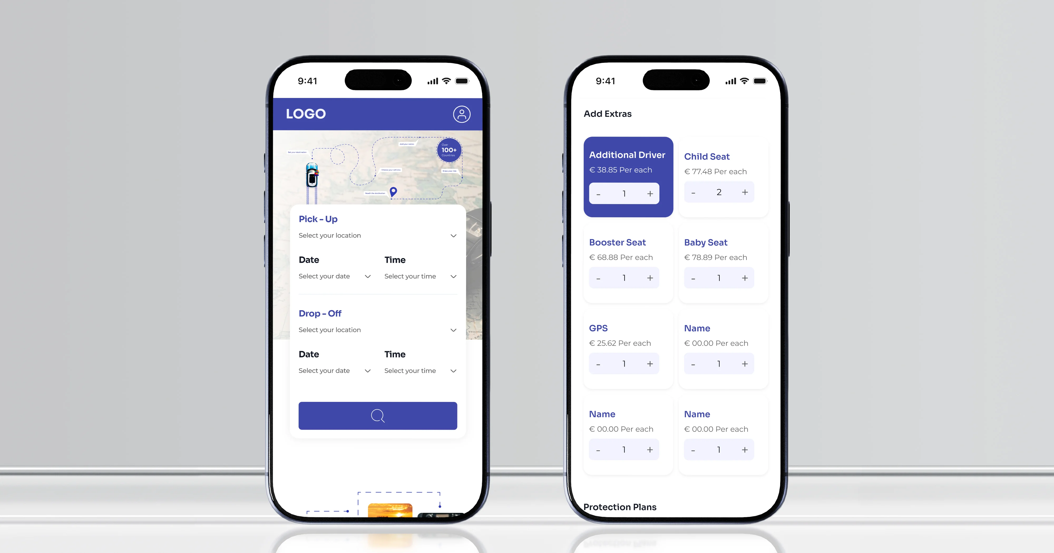
The client came to us with a peer-to-peer car rental marketplace at concept stage, aimed at both individual vehicle owners and small professional hosts. The immediate need was not engineering. It was a mobile-first product design complete and credible enough to validate the idea, open conversations with partners and early hosts, and put in front of investors, without committing to a build first.
01
Month from kick-off to developer handover44
Screens designed, desktop and mobile responsiveFunded
Client raised and launched the MVP after handover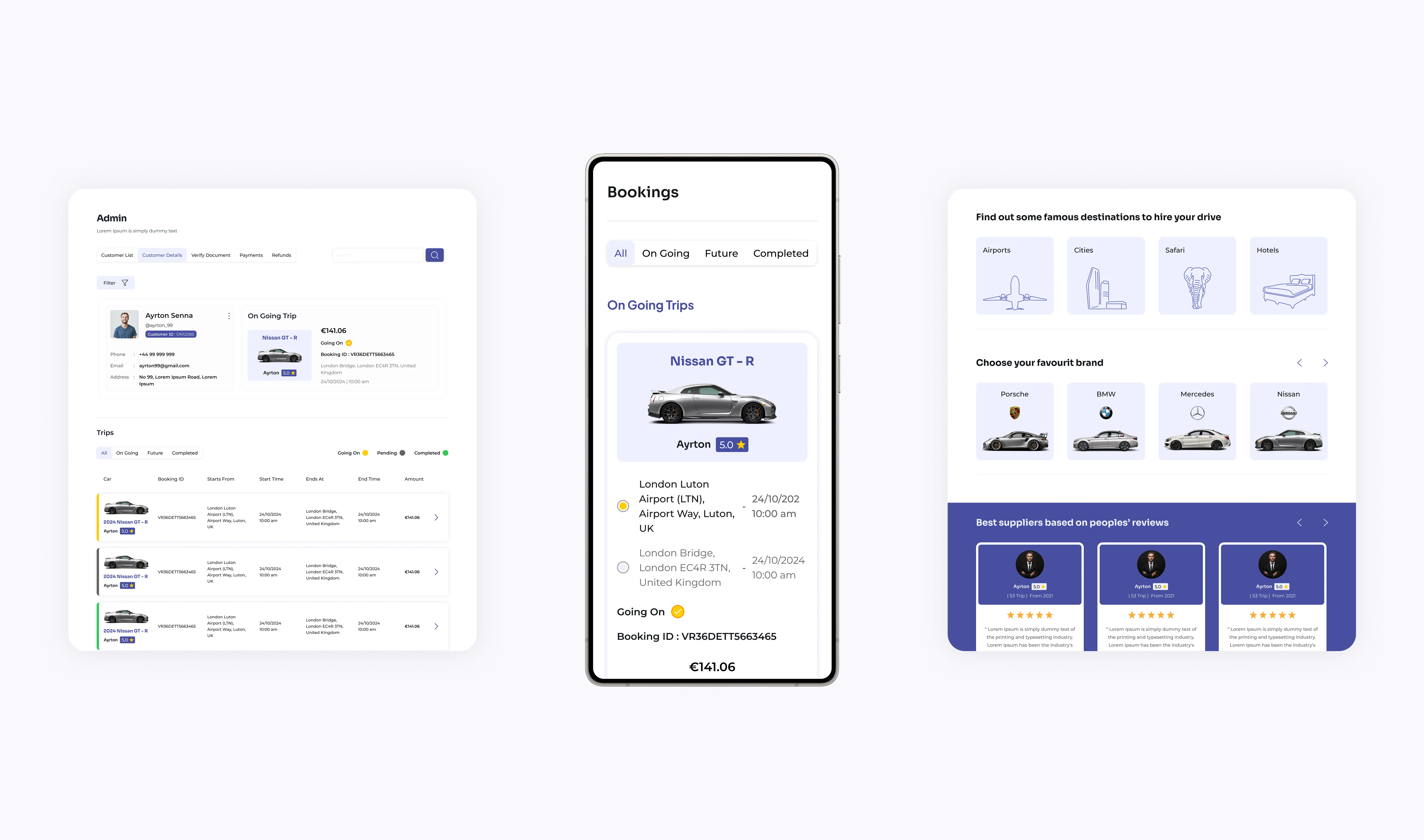
The decisions that shaped the product
01
Two sides, three roles, one product
Renters search, compare, check availability, and book. Hosts create listings, set pricing and availability, handle requests, and track earnings. Admin handles approvals, security checks, and disputes. Each role got flows built around its own work rather than one interface serving all three badly.
02
A booking flow that explains itself
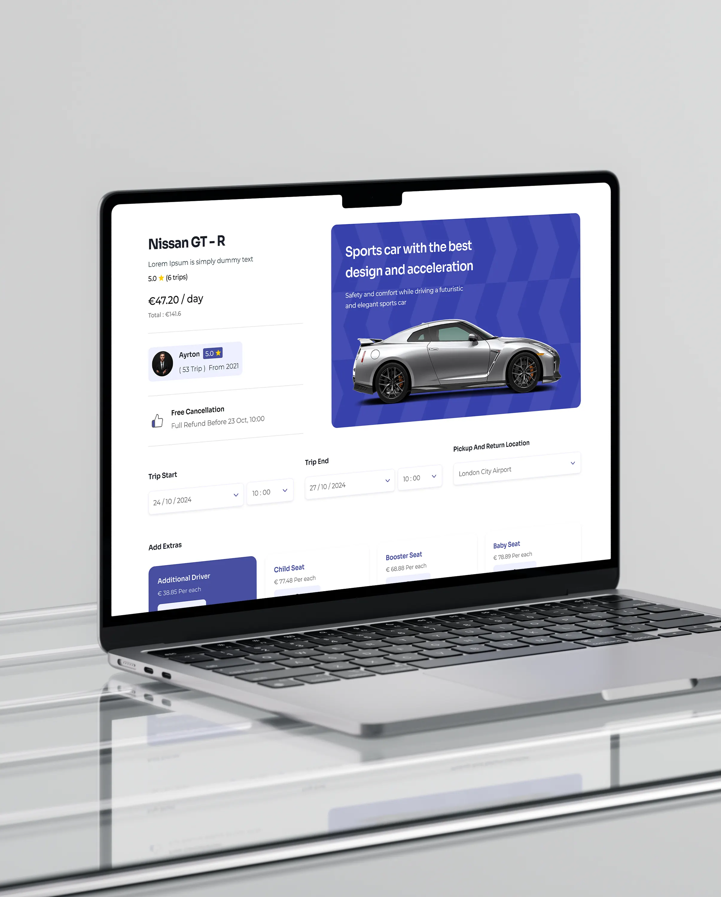
Multi-step bookings are where marketplaces lose people. The flow was built step by step, with pricing, policies, and confirmation states stated plainly at each stage, so a first-time renter always knows what they have agreed to and what happens next.
03
Listing creation for people who are not technical
A host with one car will not persevere through a complicated listing process. Creation was designed as a guided wizard with contextual prompts, so the path is obvious and errors are caught as they happen rather than at the end.
04
Trust designed in, not decorated on
In peer-to-peer rental, strangers hand over their cars. Verification indicators, reviews, and safety information were treated as core product elements with prominent placement, because the honest barrier to a marketplace like this is not usability, it is whether either side believes the other.
Our process that built a scalable solution
Research, then the marketplace model
We ran the UX research and built the user journeys before designing anything, then defined the model: three roles, what each needs from the platform, and where their journeys intersect. On a two-sided marketplace that model is the product decision. Designing screens before settling it produces a coherent interface over an incoherent product.
Flows designed for predictability
The core journeys were then built for certainty rather than novelty: a structured search with a simple filter hierarchy, a step-by-step booking flow, a guided listing wizard, and calendar views that read clearly across both single-day and multi-day bookings. Every flow was designed to be completed on a phone.
A clickable proof of concept, then a proper handover
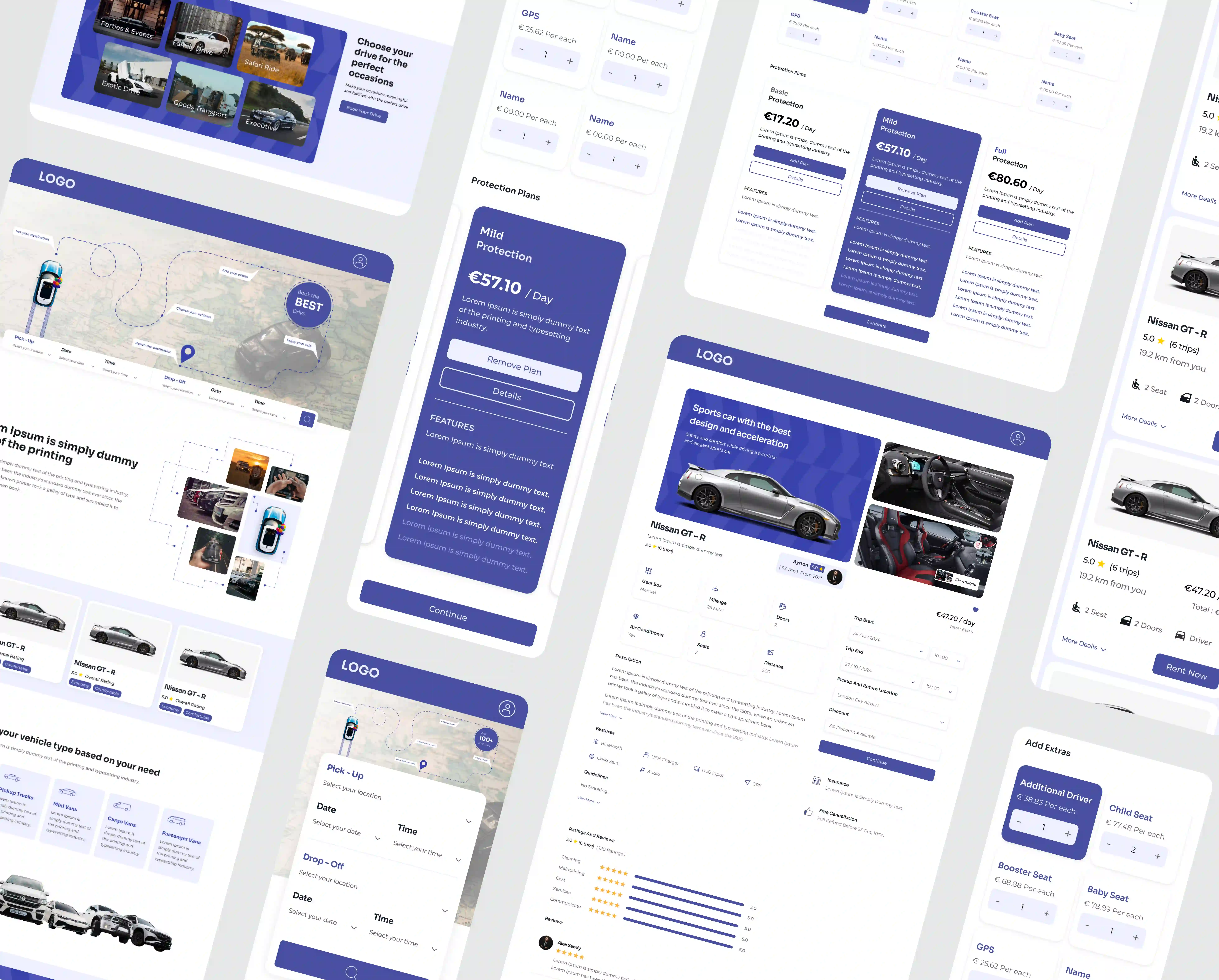
The product was proven as an interactive Figma prototype before a line of code existed, which is what the client took into investor conversations. The handover then covered developer-ready wireframes, prototypes, a structured design system, and specifications, organised as a modular system across search and discovery, bookings and requests, host listings and availability, earnings and history, and admin oversight. Development started from a defined product rather than a set of pictures.
Deliverables

What we did
The visual design was built for a UK and EU audience, prioritising clarity, space, and readability so the product works for a quick booking and a long browse equally. Underneath it, everything was organised as a modular system rather than a set of screens, which is why the design system already accommodates the milestones the client has coming: payments, insurance integration, and location-based delivery.
Result and impact
The handover is why the launch followed cleanly. Developer-ready prototypes, specifications, and a modular design system meant development began from a defined product rather than an interpretation of one, and nothing designed in that month had to be redone. Payments, insurance integration, and location-based delivery are already accounted for in the structure, so the features coming next extend the system rather than forcing a redesign.
Frequently asked questions
Can you design the product without building it?
Yes, and for an early-stage marketplace it is often the right sequence. This client needed something credible for partners and investors before committing to engineering spend, raised on it, and built afterwards. Because the handover was developer-ready, none of the design work had to be redone.
What does investor-ready actually mean?
That the product can be shown rather than described: real screens, real flows, and an interactive prototype someone can click through. This client raised on a Figma prototype and launched afterwards. Investors assessing a marketplace want to work through how both sides of it function, not read about it.
How do you design a two-sided marketplace?
By settling the model before the screens. We defined three roles, renters, hosts, and admin, and what each needs from the platform, then designed the flows where those journeys meet. Getting that wrong produces a tidy interface over a product that does not work.
How do you design for trust and safety?
As product elements rather than reassurance copy. Verification indicators, reviews, and safety information were given prominent placement throughout, because in peer-to-peer rental the real barrier is whether each side trusts the other, not whether the app is easy to use.
What do our developers receive?
Developer-ready wireframes, interactive prototypes, high-fidelity screens, a structured design system, and specifications. Your team or ours can build from it, and the modular structure means new features extend the system rather than breaking it.
Can you build it afterwards?
Yes, and we frequently do. Designing with implementation in mind means the build phase starts from a defined product. If you would rather use your own developers, the handover is documented for that.
How much does UX design for an MVP cost?
Cost follows the number of user roles, the number of screens, and how much of the product is still undecided. Every project is quoted with fixed scope and price in writing before work starts.
Can you design the product without building it?
Yes, and for an early-stage marketplace it is often the right sequence. This client needed something credible for partners and investors before committing to engineering spend, raised on it, and built afterwards. Because the handover was developer-ready, none of the design work had to be redone.
How do you design a two-sided marketplace?
By settling the model before the screens. We defined three roles, renters, hosts, and admin, and what each needs from the platform, then designed the flows where those journeys meet. Getting that wrong produces a tidy interface over a product that does not work.
What do our developers receive?
Developer-ready wireframes, interactive prototypes, high-fidelity screens, a structured design system, and specifications. Your team or ours can build from it, and the modular structure means new features extend the system rather than breaking it.
How much does UX design for an MVP cost?
Cost follows the number of user roles, the number of screens, and how much of the product is still undecided. Every project is quoted with fixed scope and price in writing before work starts.
What does investor-ready actually mean?
That the product can be shown rather than described: real screens, real flows, and an interactive prototype someone can click through. This client raised on a Figma prototype and launched afterwards. Investors assessing a marketplace want to work through how both sides of it function, not read about it.
How do you design for trust and safety?
As product elements rather than reassurance copy. Verification indicators, reviews, and safety information were given prominent placement throughout, because in peer-to-peer rental the real barrier is whether each side trusts the other, not whether the app is easy to use.
Can you build it afterwards?
Yes, and we frequently do. Designing with implementation in mind means the build phase starts from a defined product. If you would rather use your own developers, the handover is documented for that.
Got a product you need to show before you build it?

Tell us what you are building. We will scope it and give you an honest view of the right approach and what it will cost.
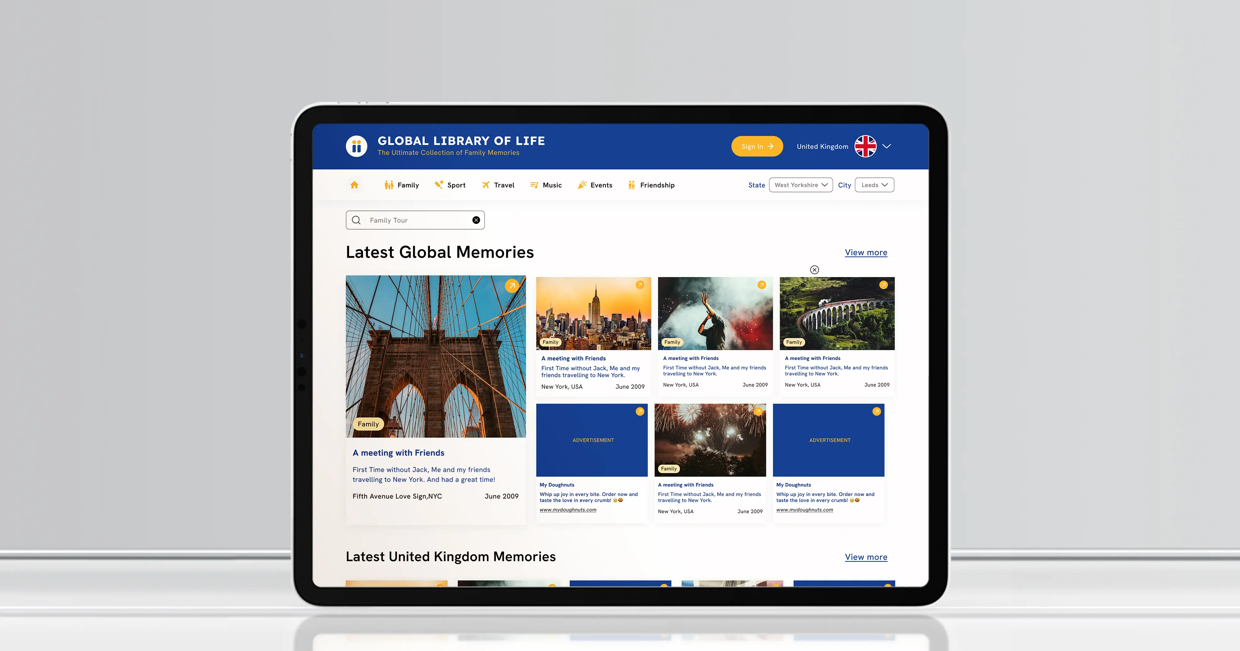
Miigen memory platform MVP
Another concept-stage product with several user groups, taken to something a founder can raise on. See that case study.
Read the case study →